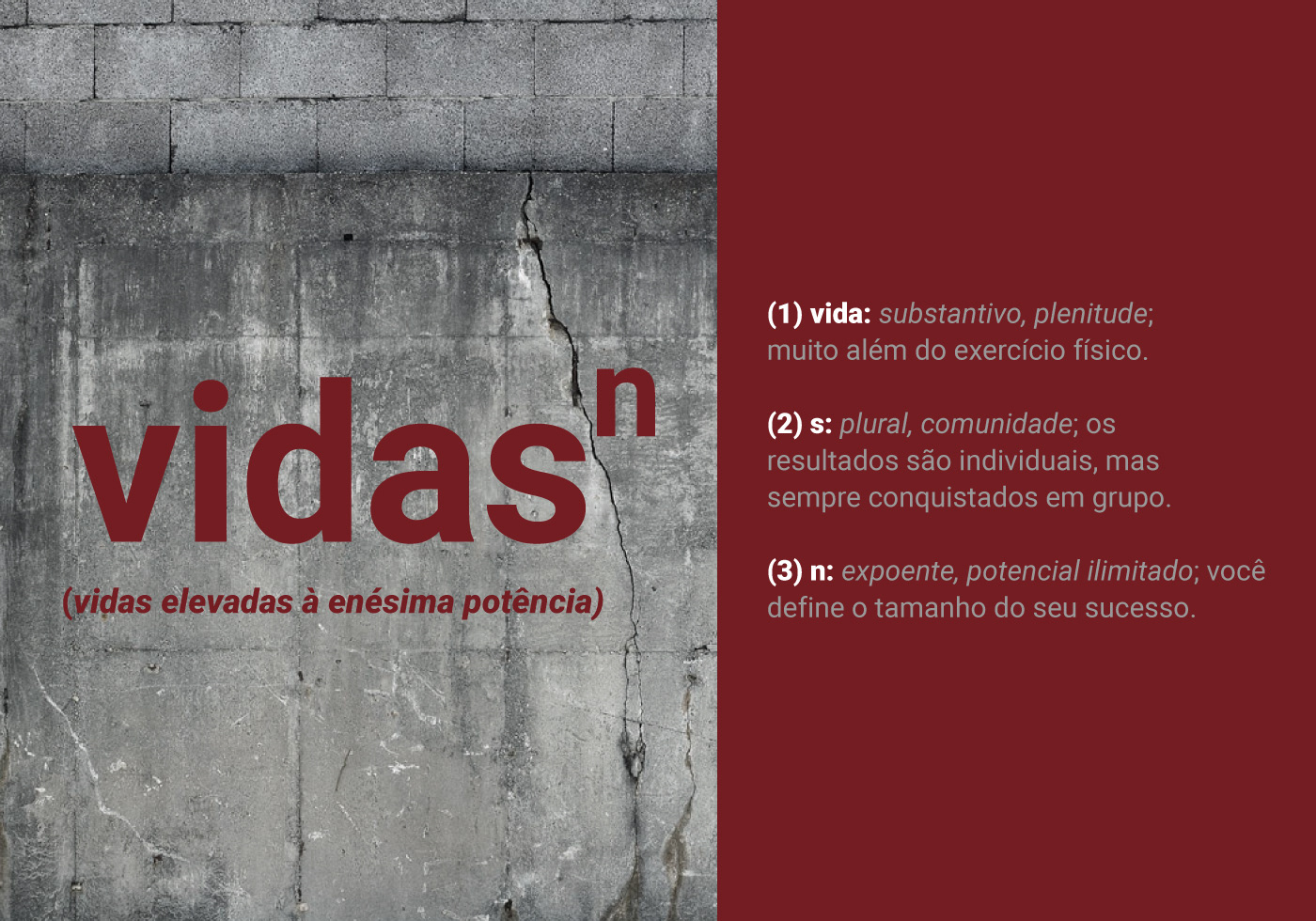
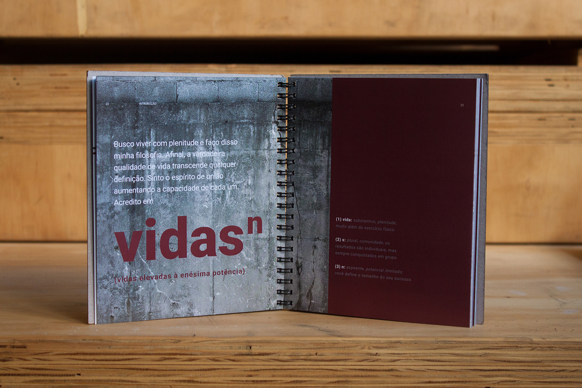
Human lives raised to the Nth power
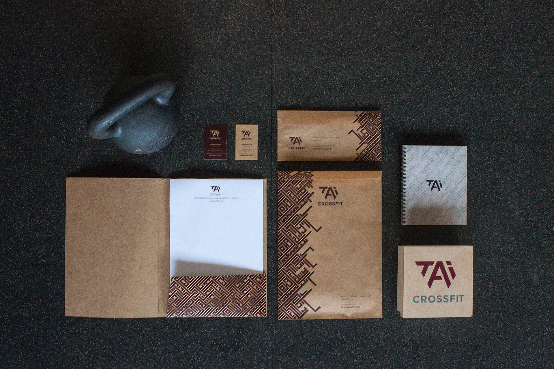
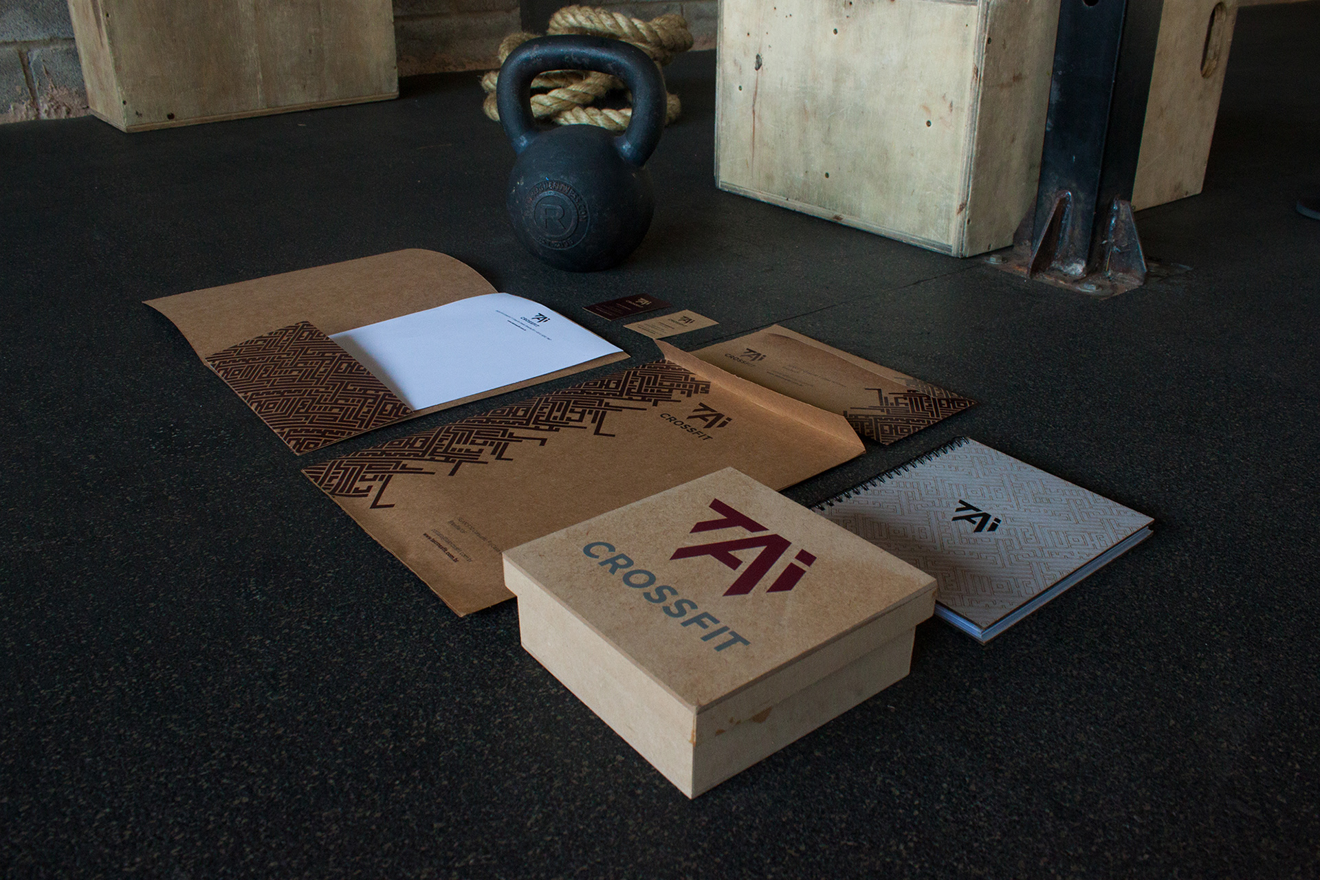
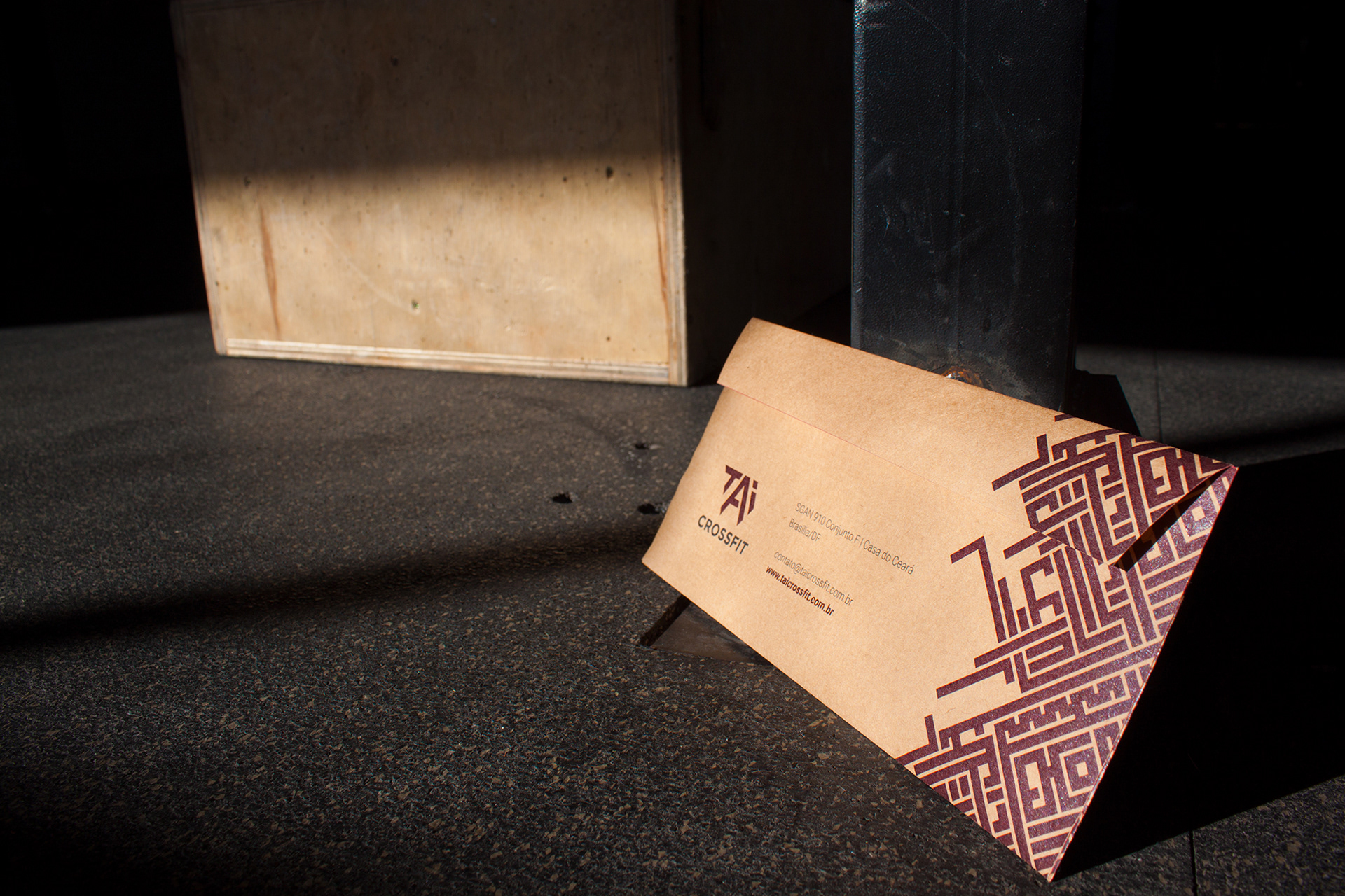
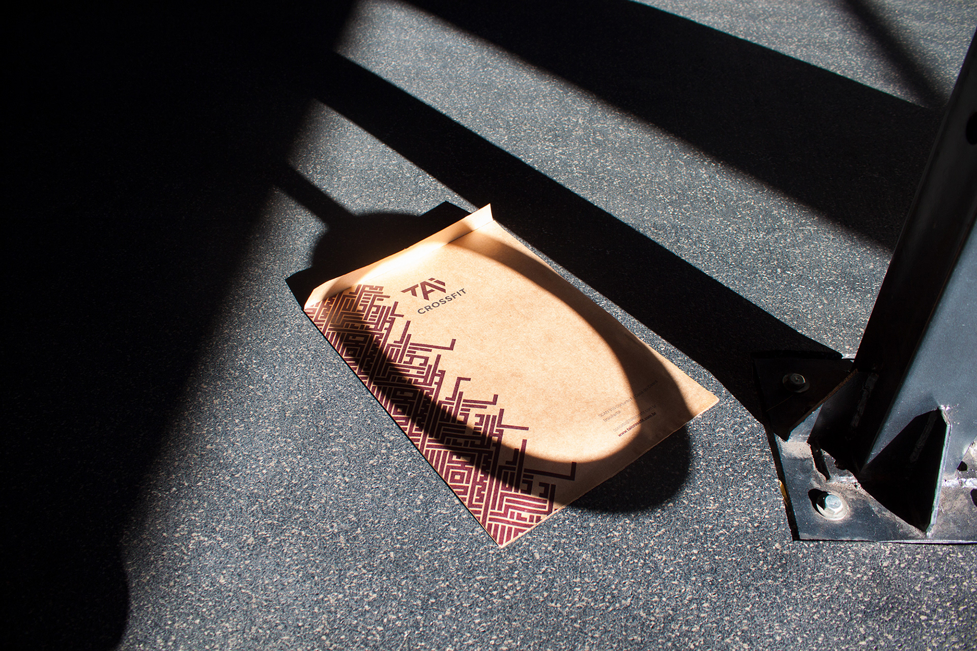
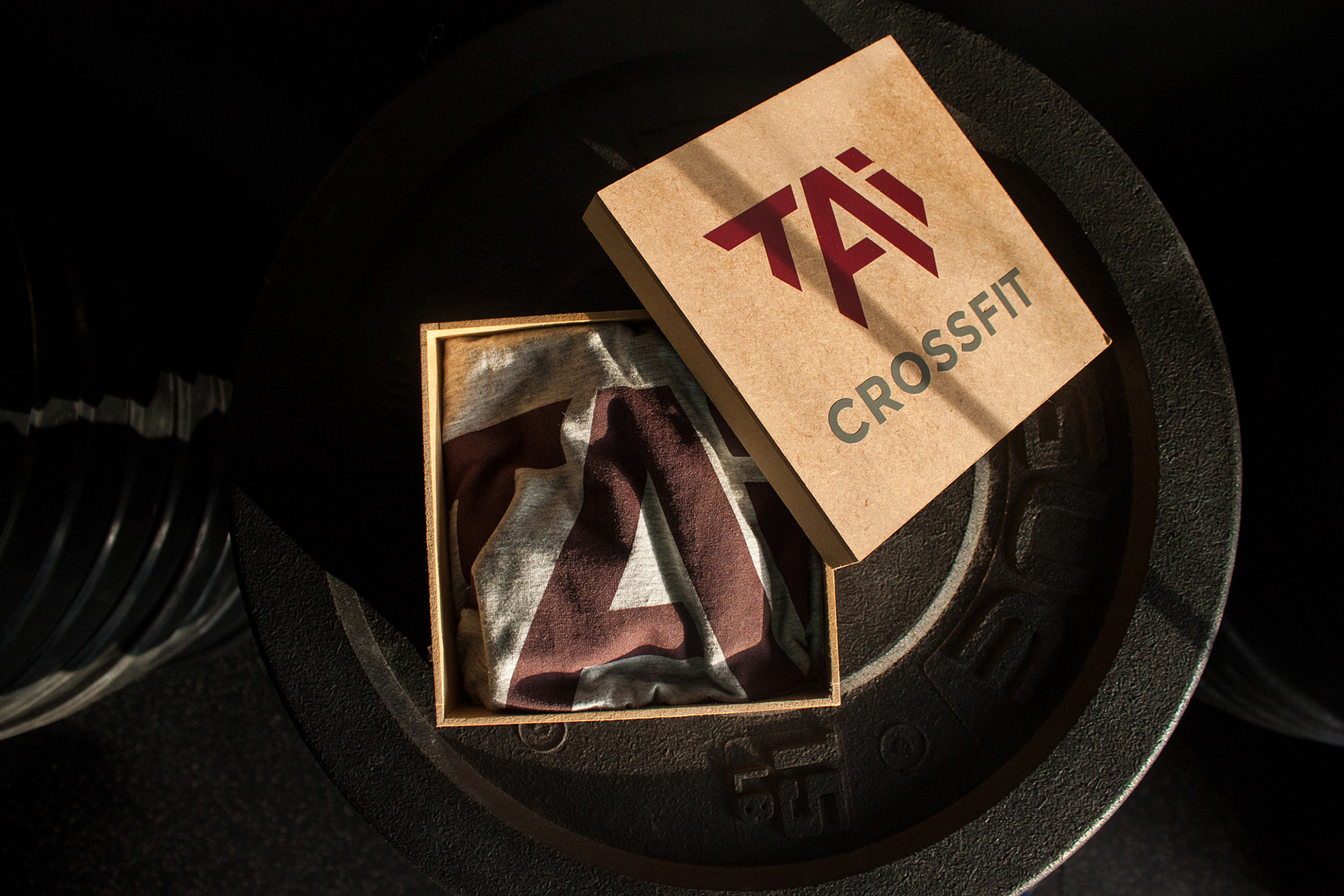
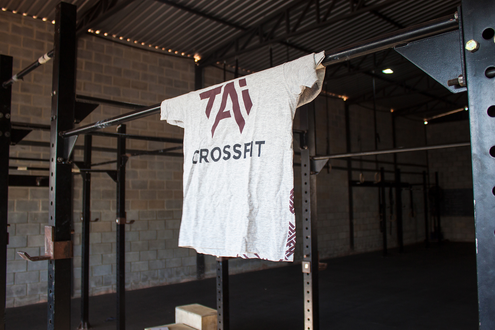
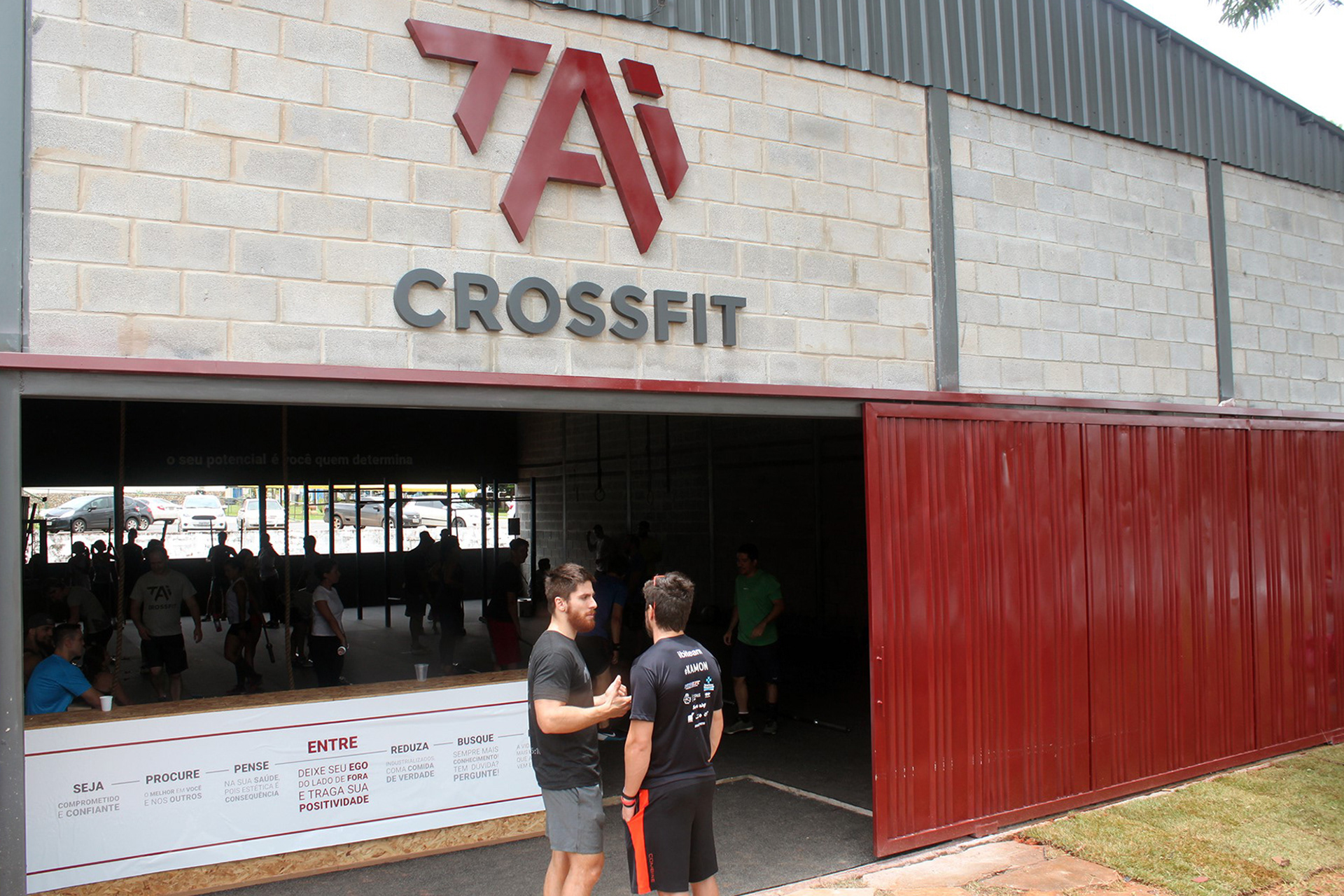
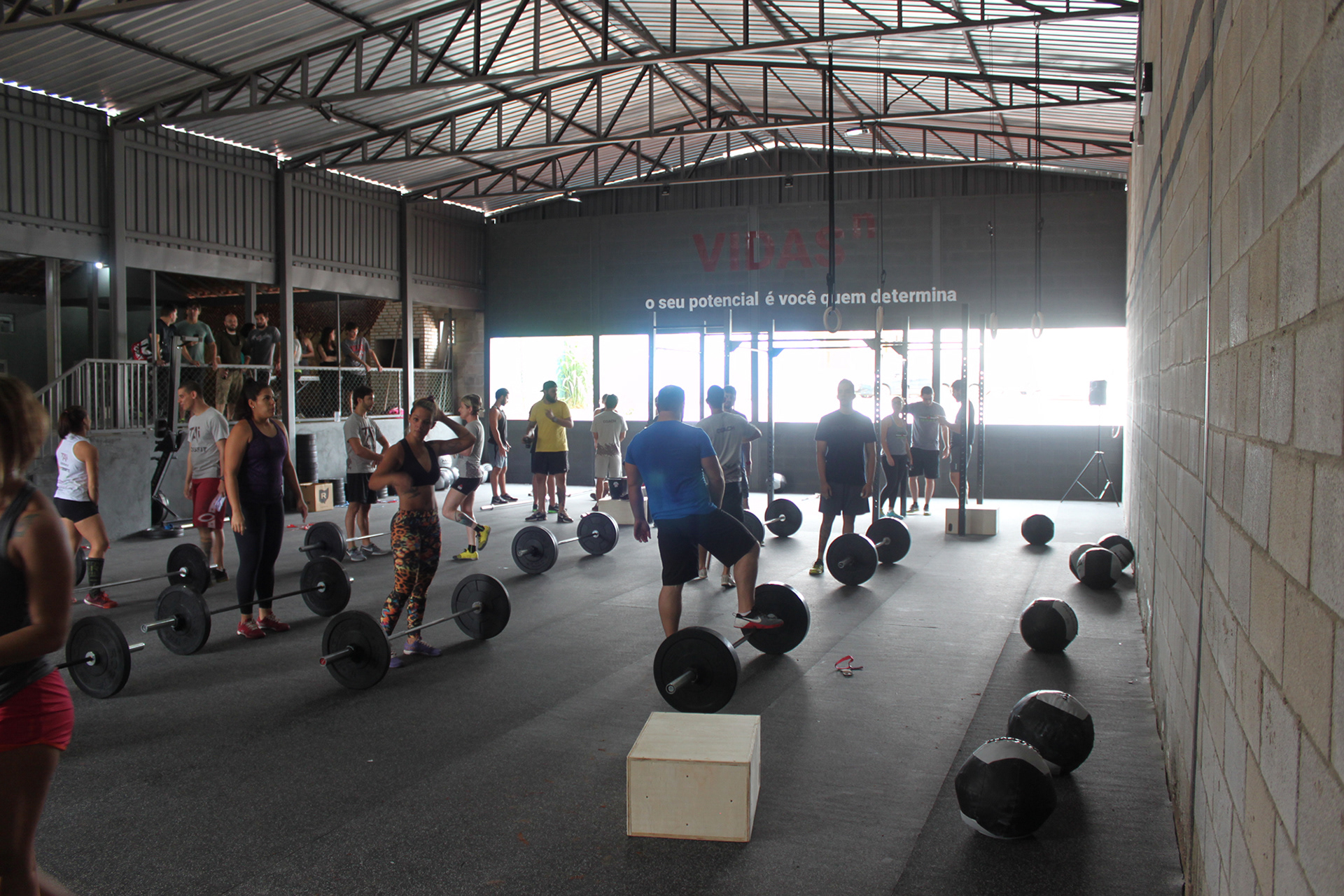
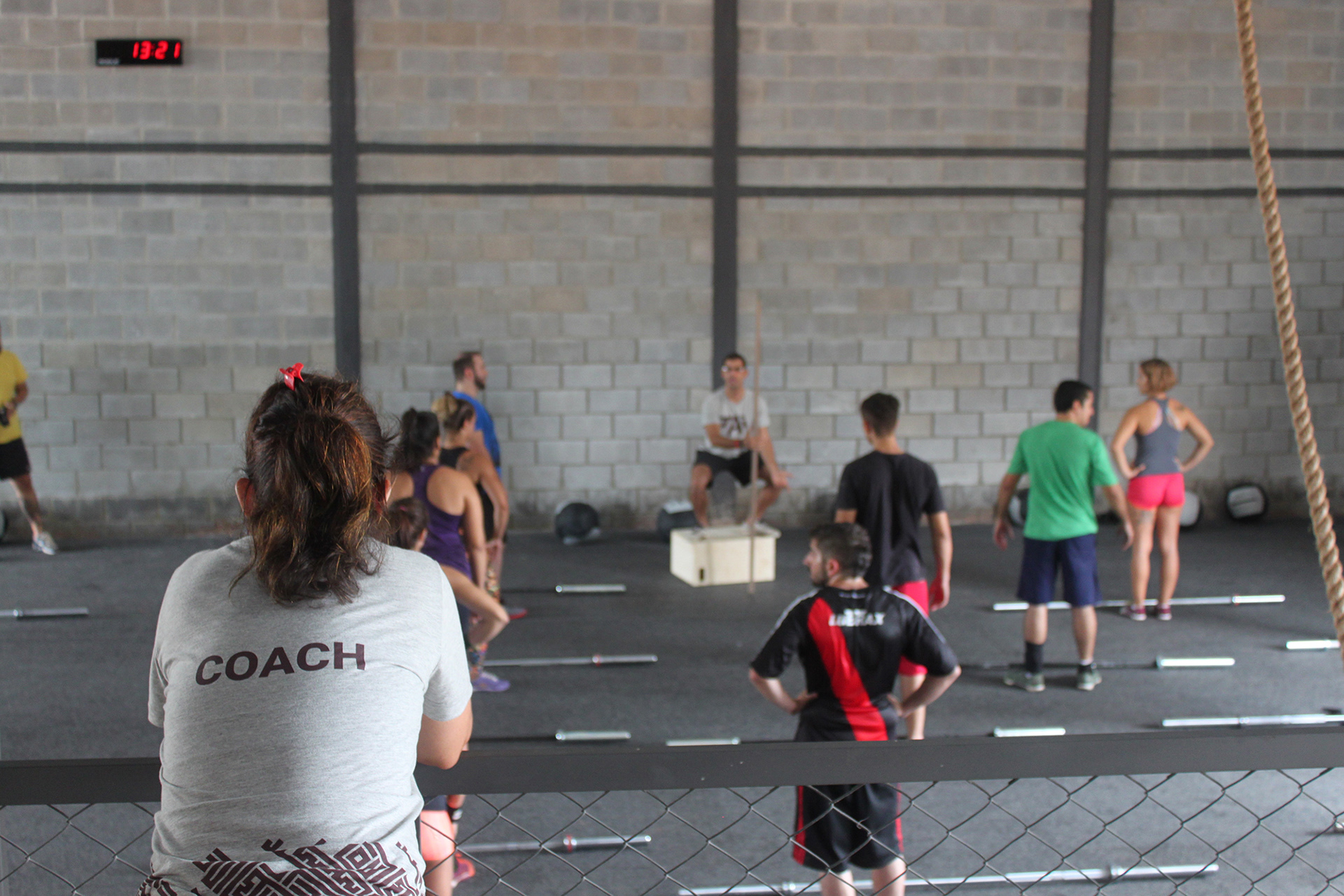
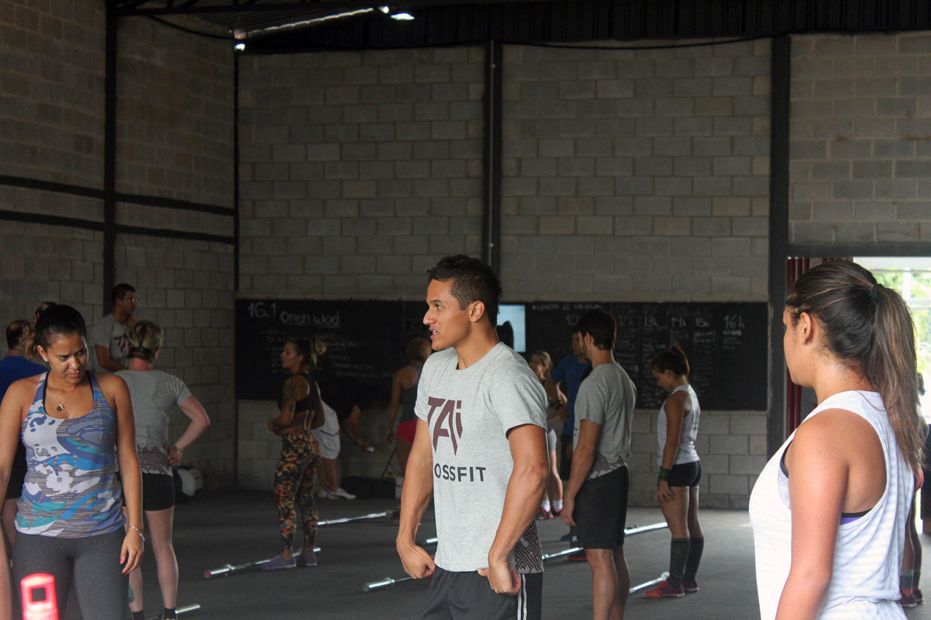
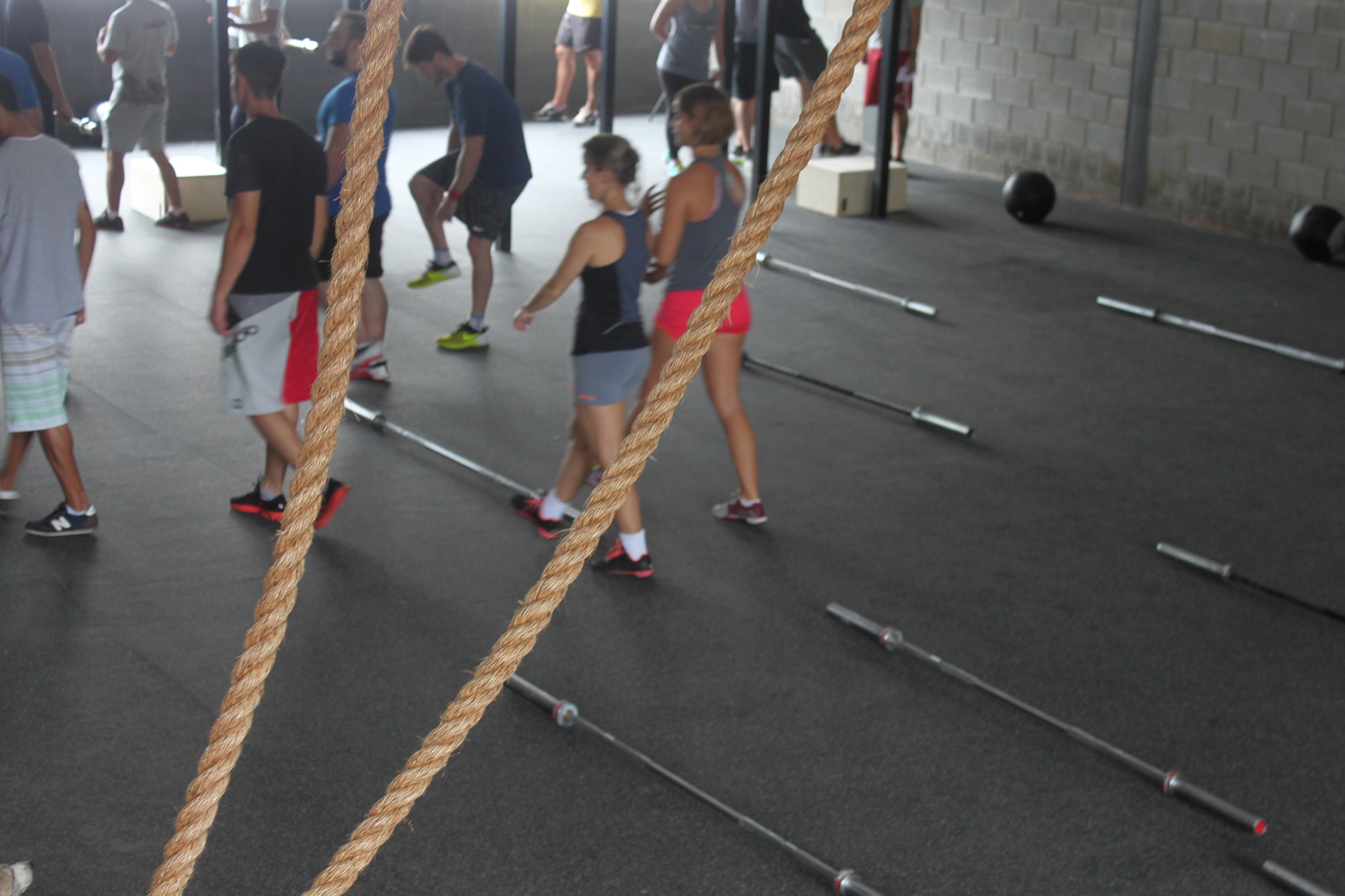
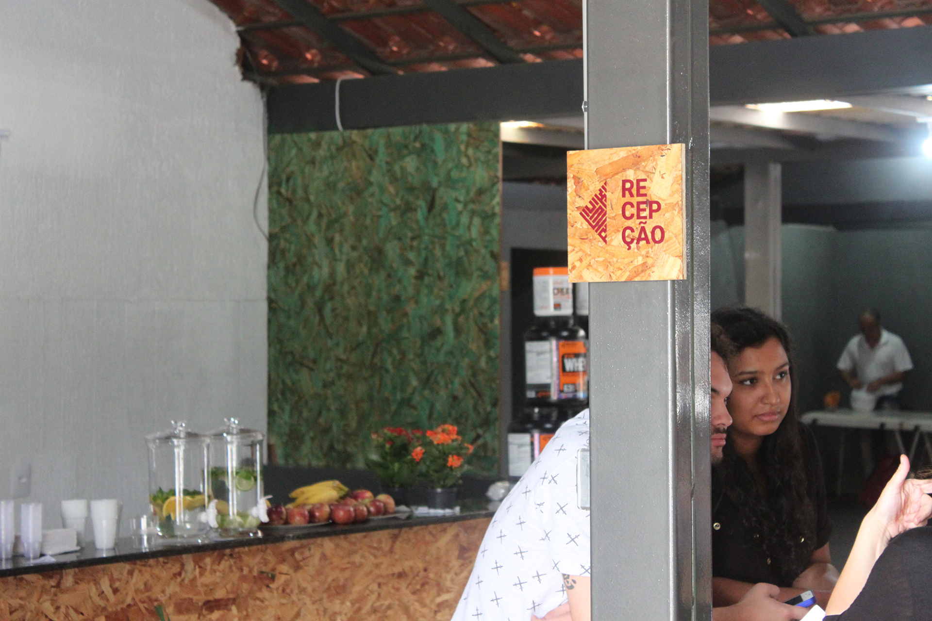
TAI is a local CrossFit box committed to provide a healthy life to people following the tripod consistency/nutrition/fitness. The founders are proud of the family environment they created, in which individual growth is enhanced by community support. We were responsible for its brand identity.
Concept
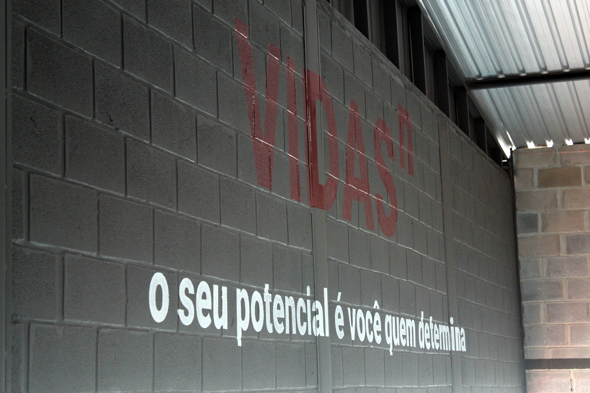
Being healthy is more than simply exercising and following a balanced diet. It requires acquiring good habits consistently. This is the principle that structures the brand personality.
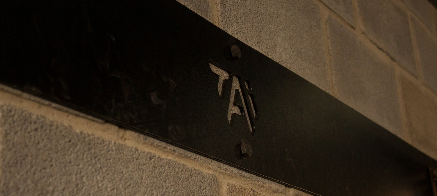
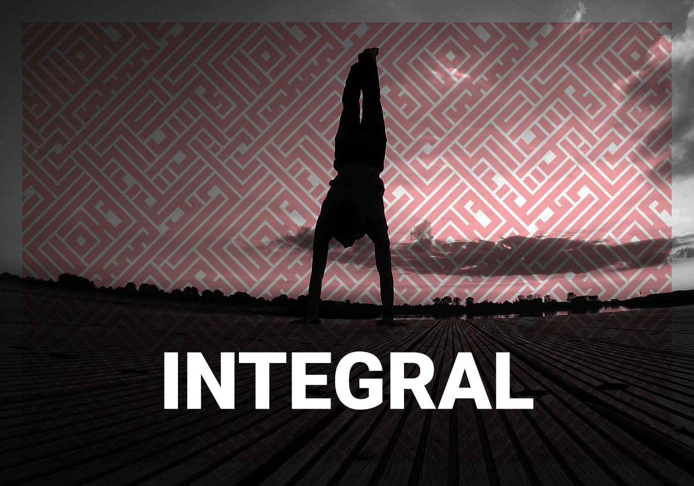
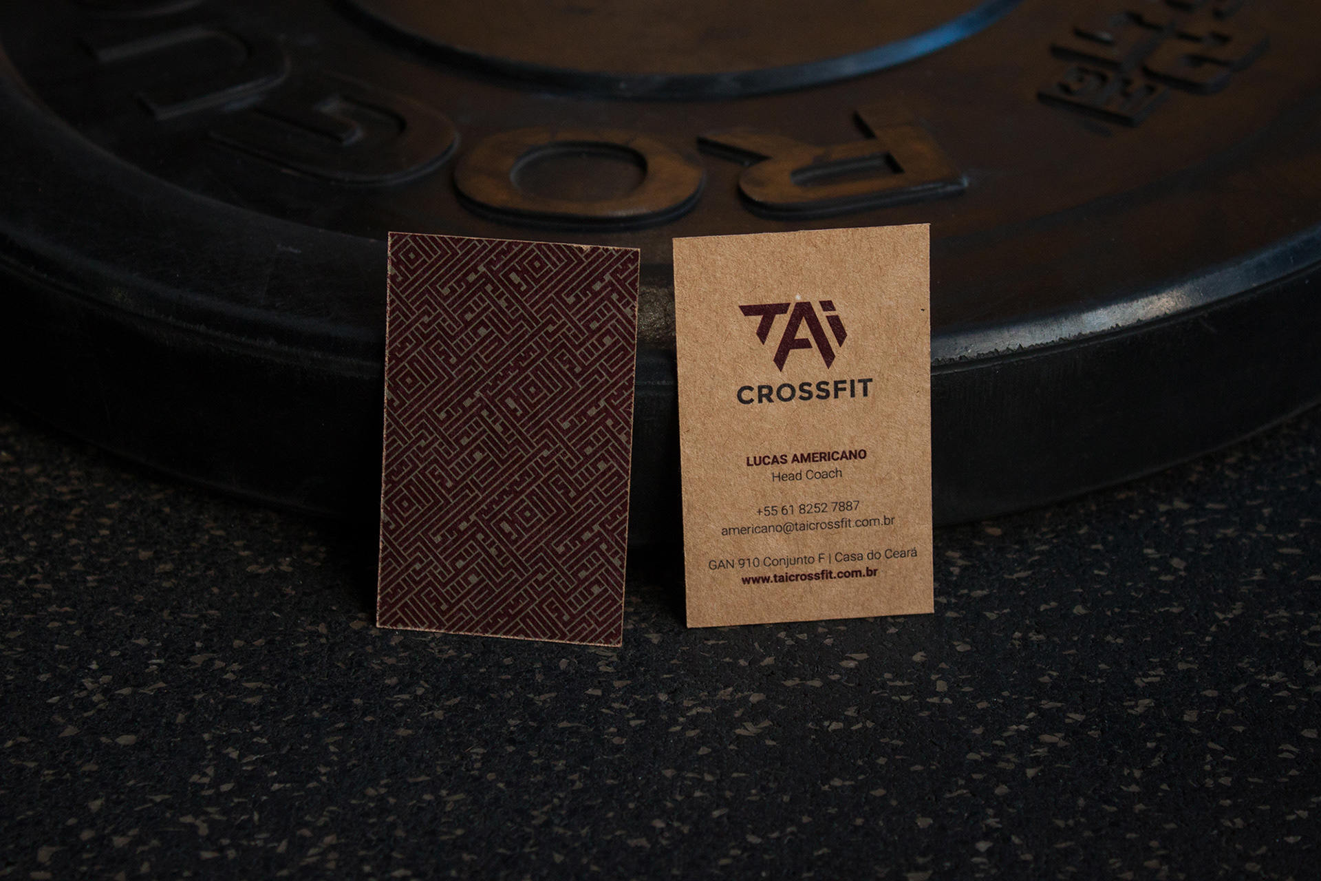
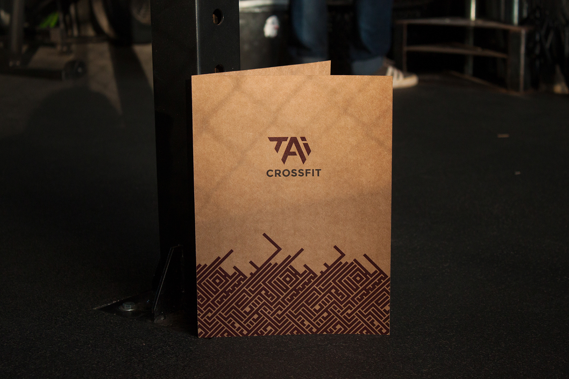
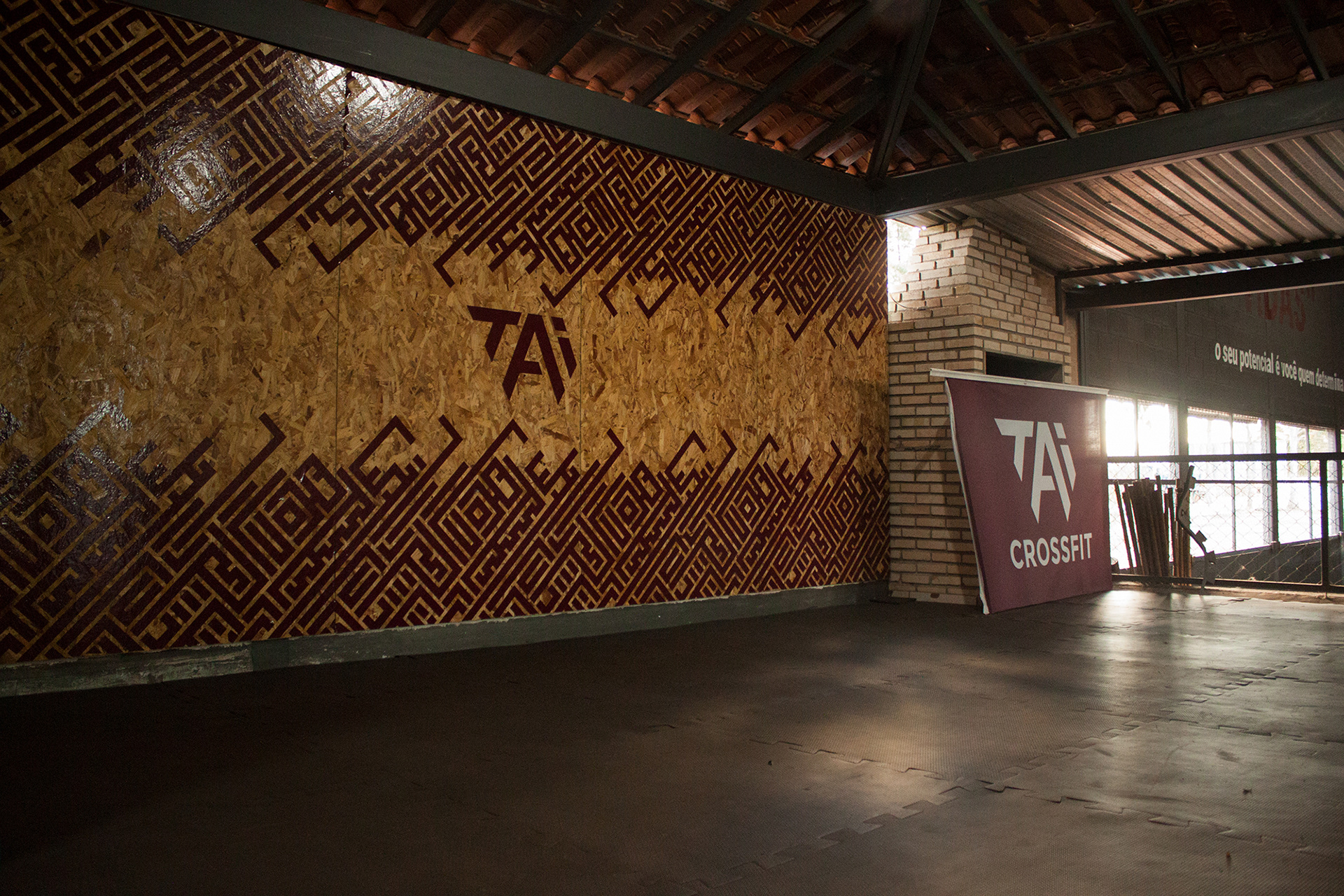
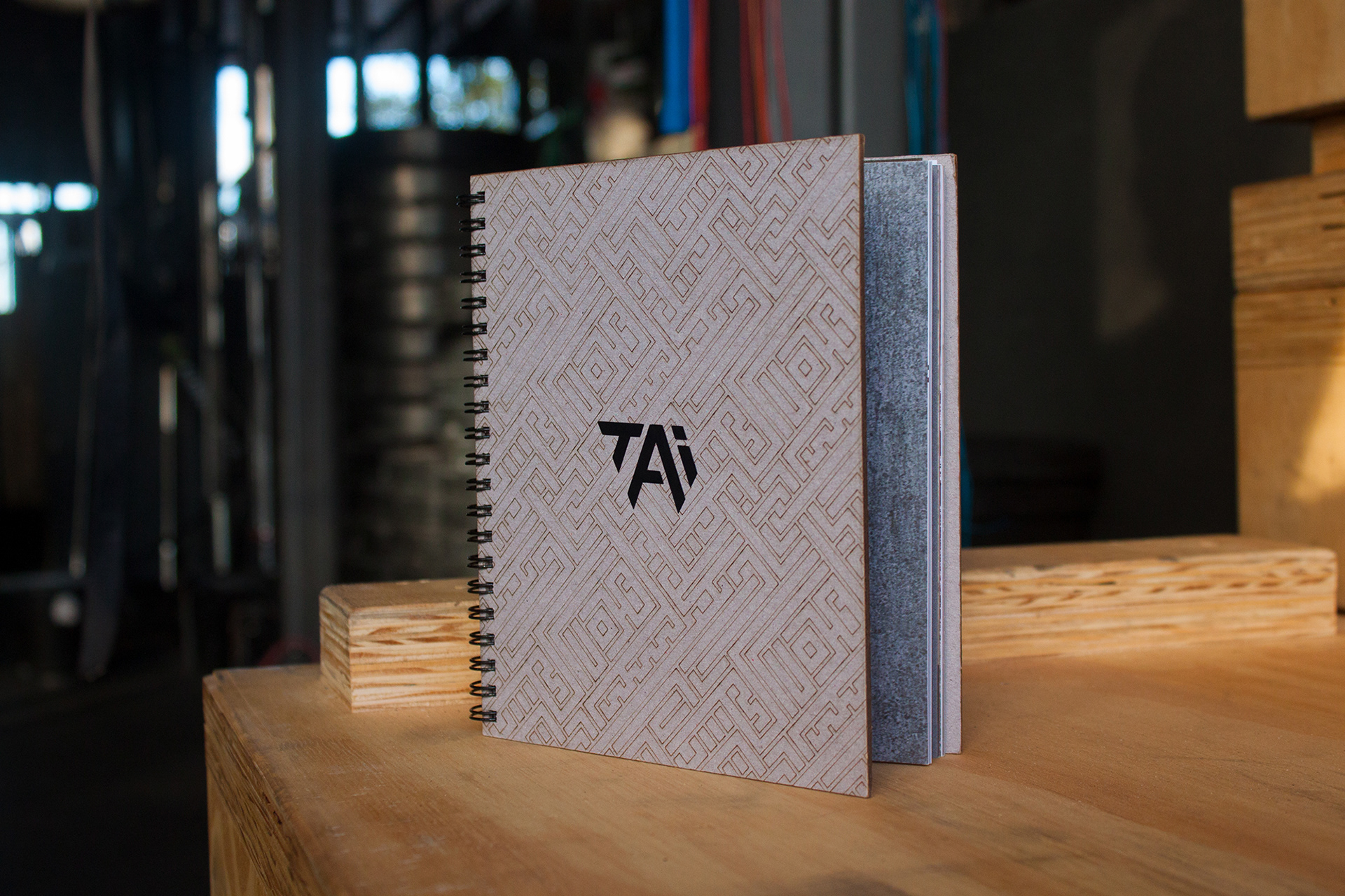
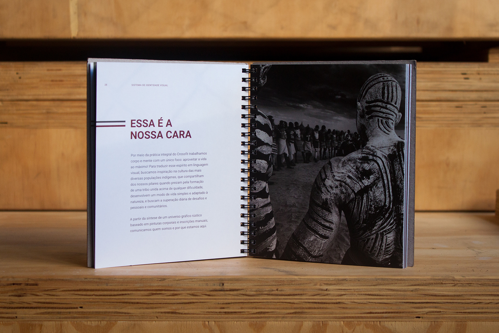
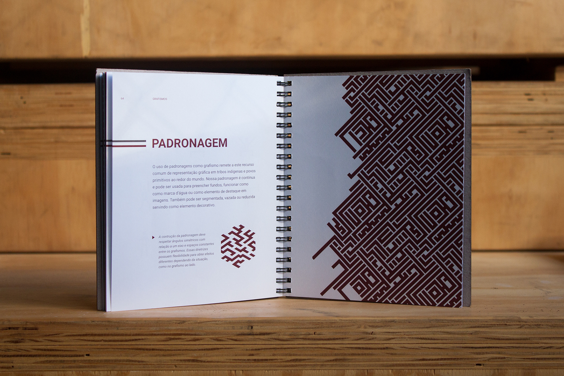
The name TAI comes from the traditional Chinese and means body and mind together, the two elements that CrossFit values to ensure a good lifestyle. The logo is designed with angled strokes forming a triangle that represents the balance between consistency, nutrition and fitness. Its inverted position resembles superhero crests, associated with the idea of overcoming limits and developing extraordinary skills. The graphics are marked by tribal-inspired patterns and the a dark red shade, which refers to blood.

Design team
Teo Horta, Henrique Meuren, Ricki Lustoza
Teo Horta, Henrique Meuren, Ricki Lustoza