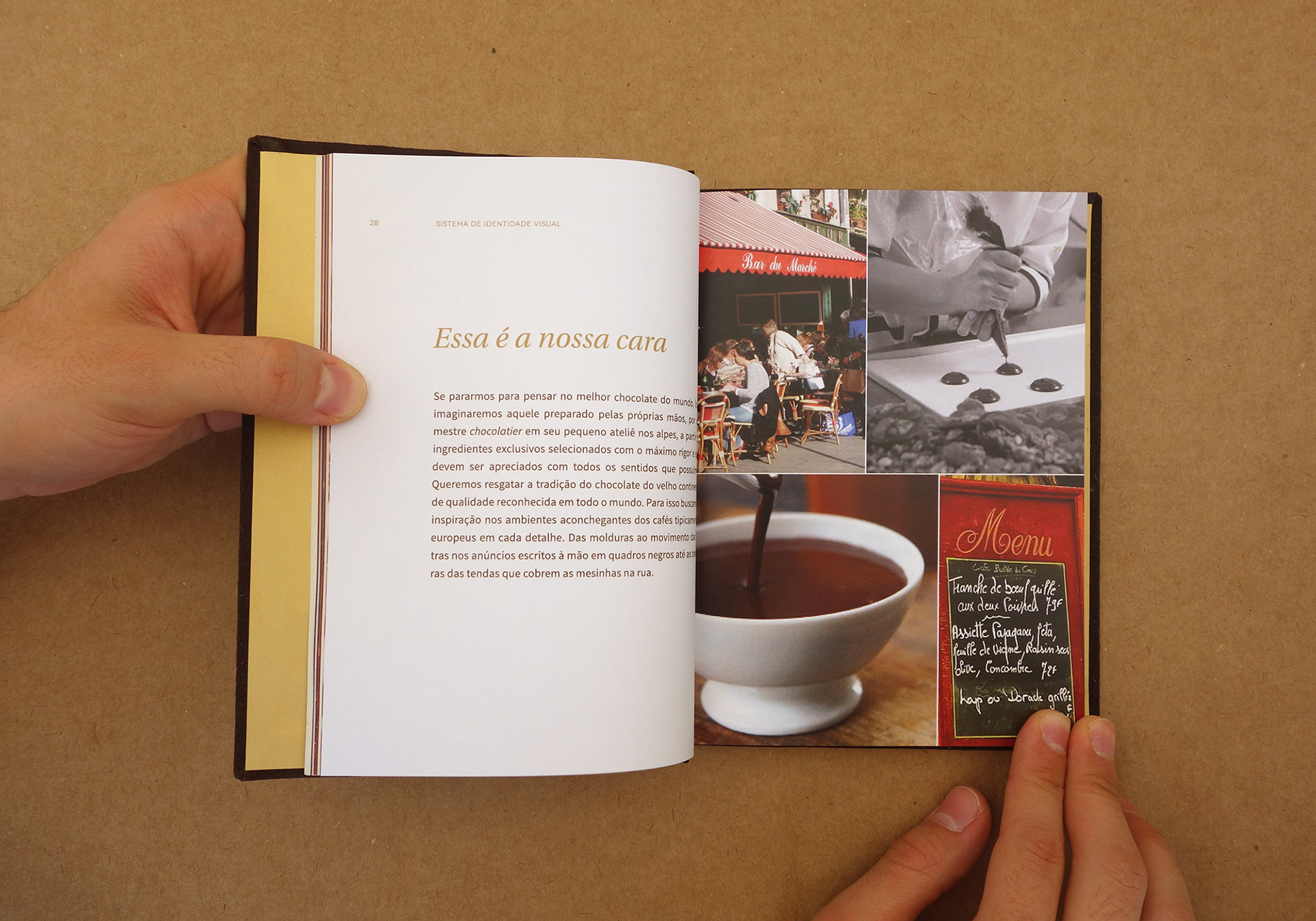
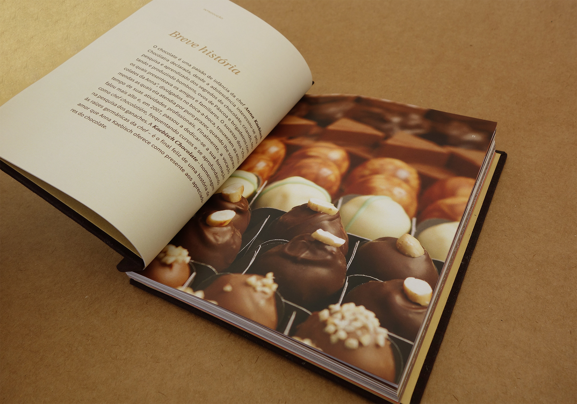
Moments with chocolate
Kaebisch is a local brand that offers fine handmade chocolate in a cosy environment inspired by European cafés. After 8 years on the market, Estúdio Marujo was hired with the aim of updating and standardising its brand identity. We were responsible for the brand design including several touch points, from the renewal of the whole packaging set to the online and offline collateral.
Concept
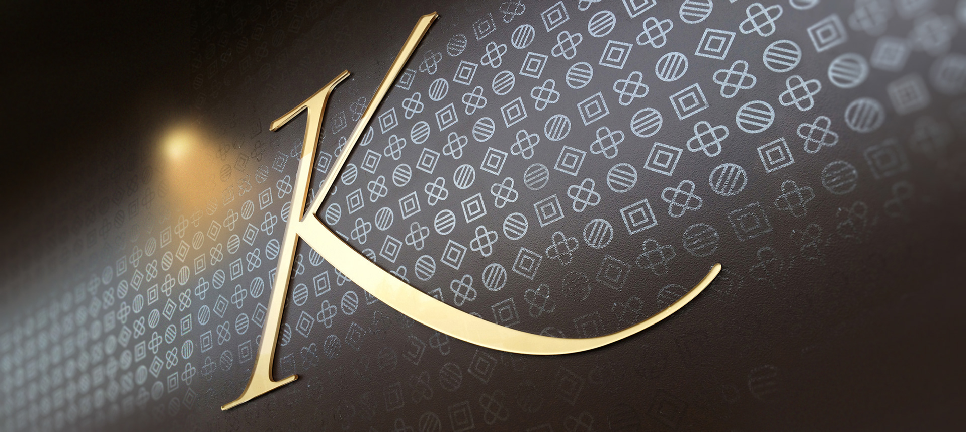
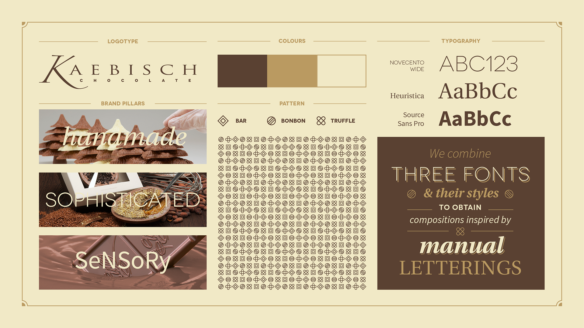
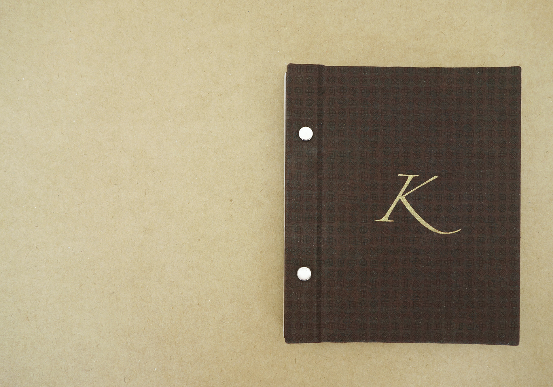
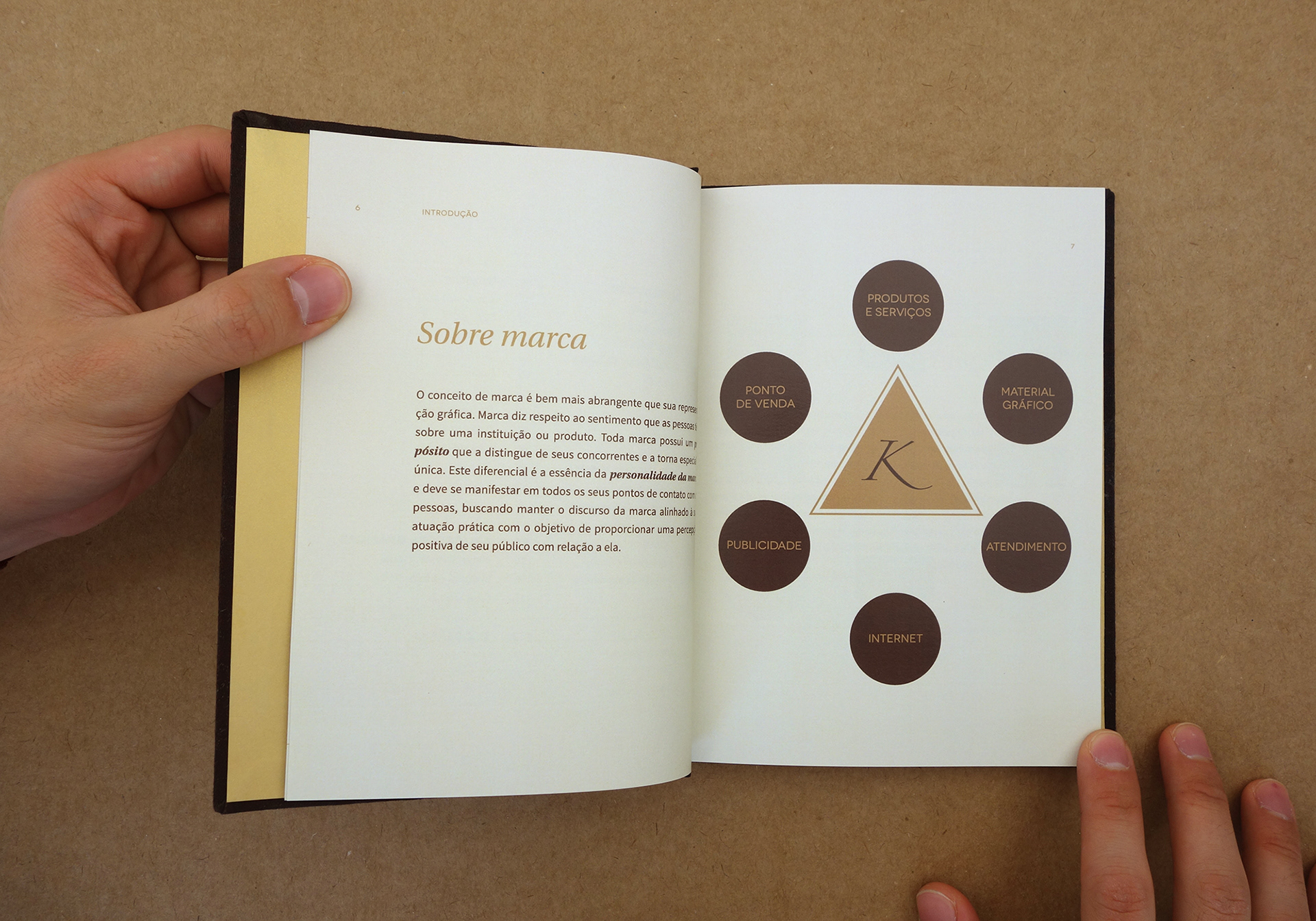
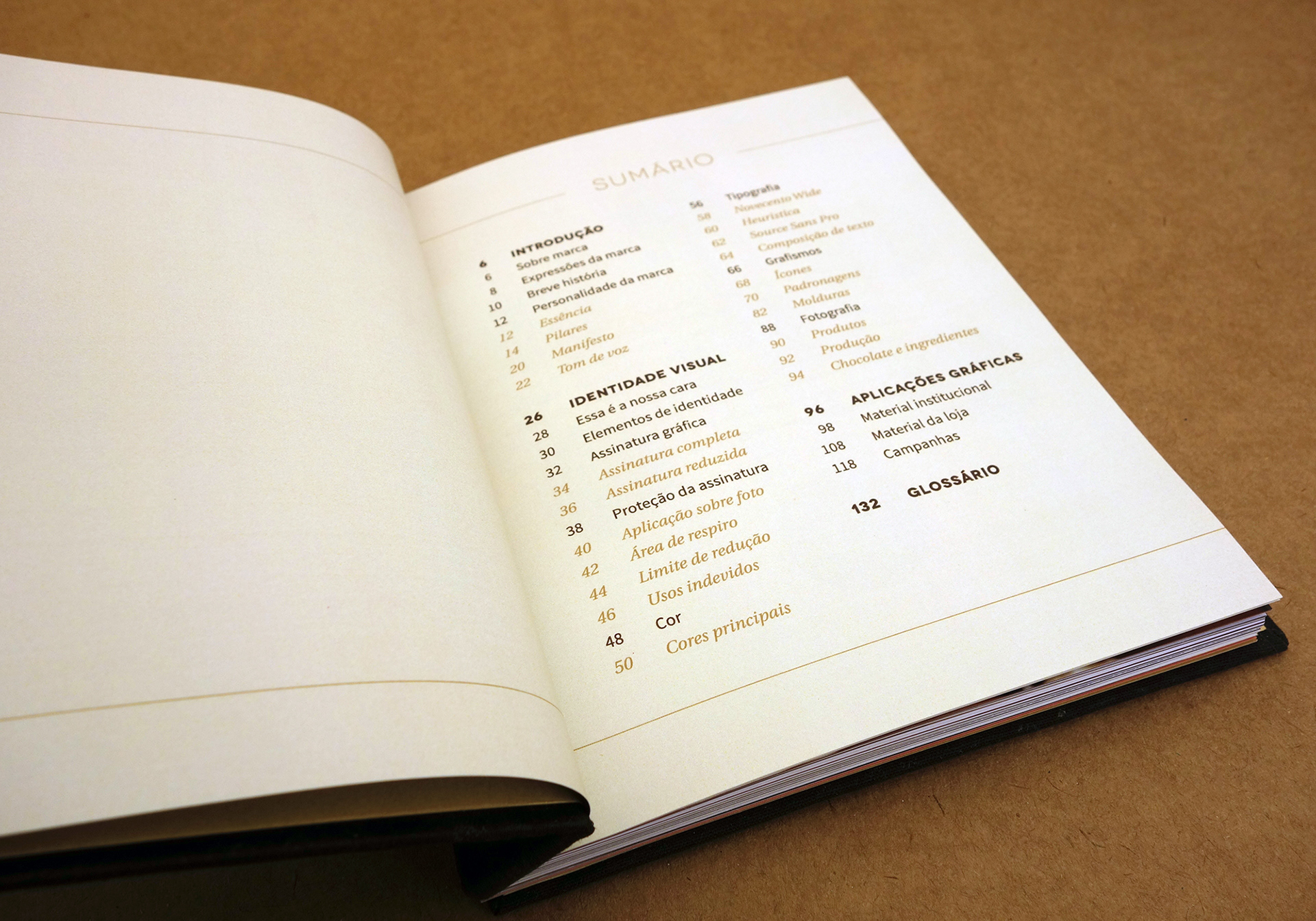
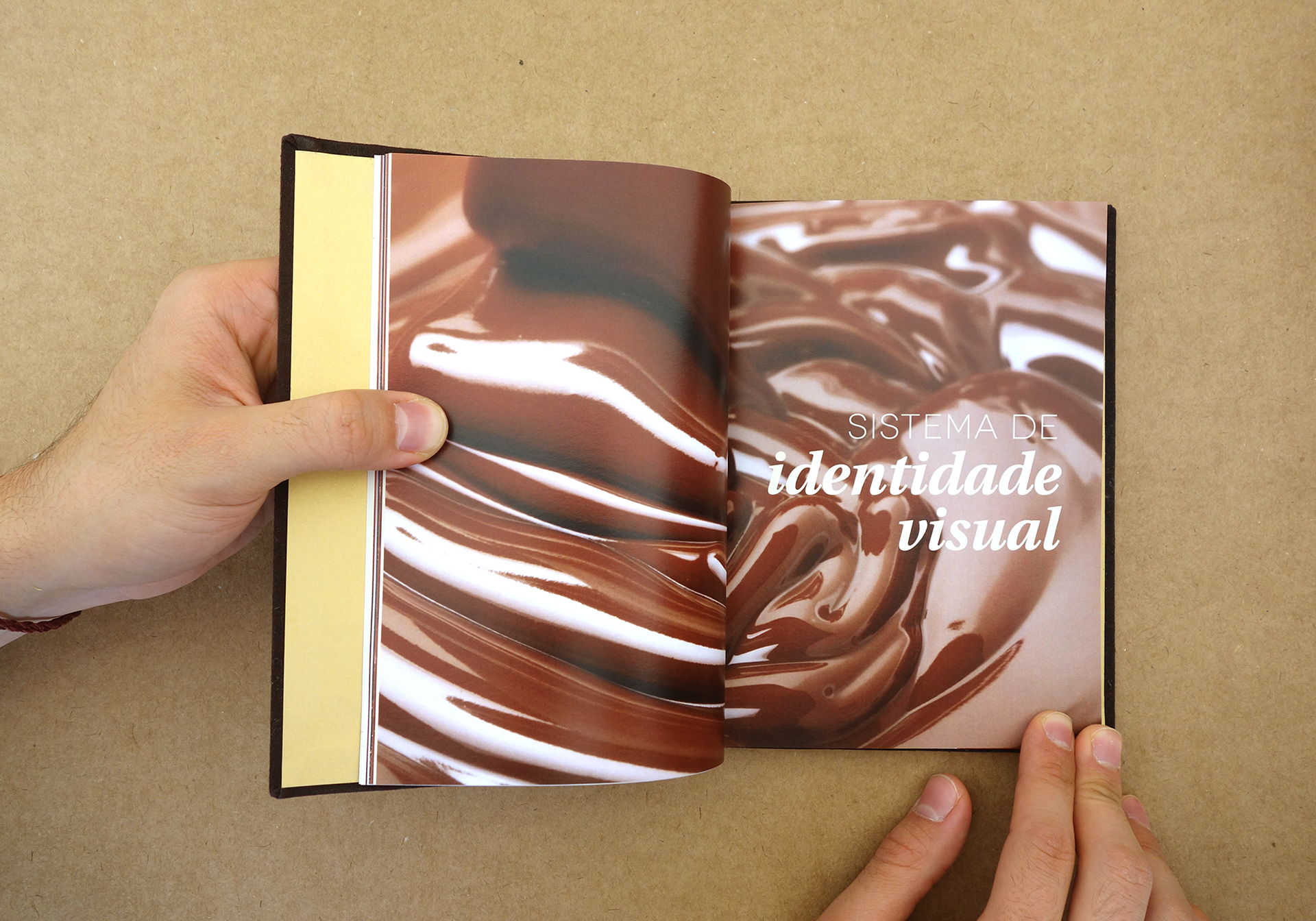
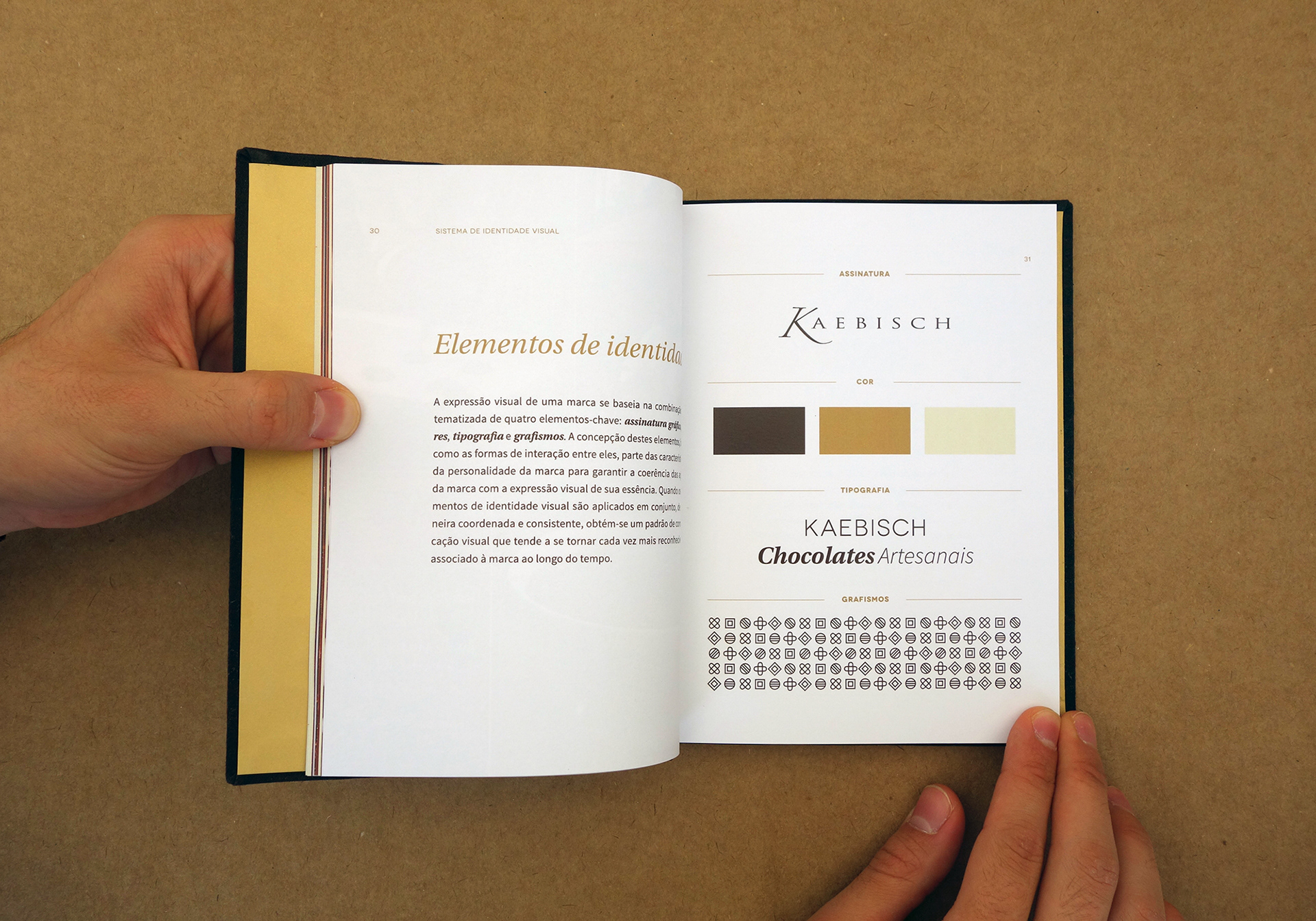
The project began by defining the brand values and personality structured across three brand pillars. From this first step we established new brand guidelines, taking advantage of some of the assets already recognised by the customers. The typographic logo had minor adjustments, while the colour palette was revamped within three main hues: two of them inspired on black and white chocolate, and a third golden one to add a touch of luxury to the mood. Three typefaces with complementary characteristics are combined simulating hand letterings as in the typical menu boards of European cafés.
Packaging
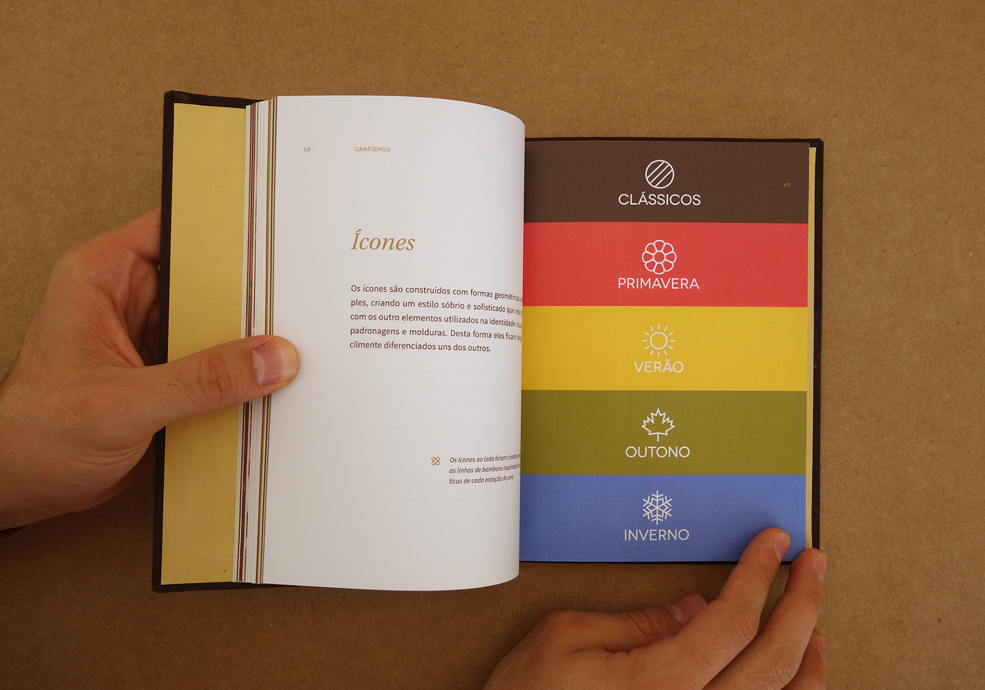
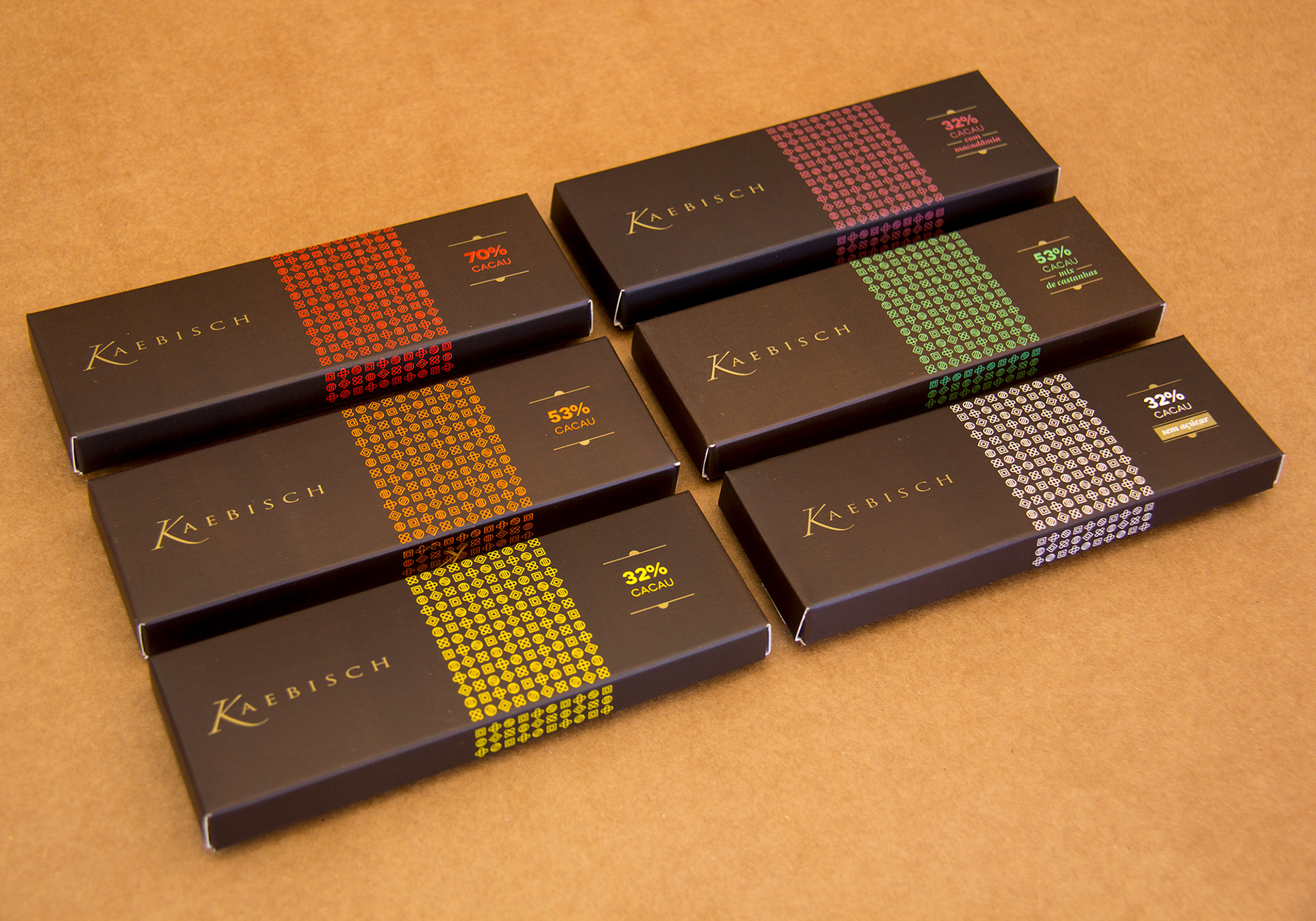
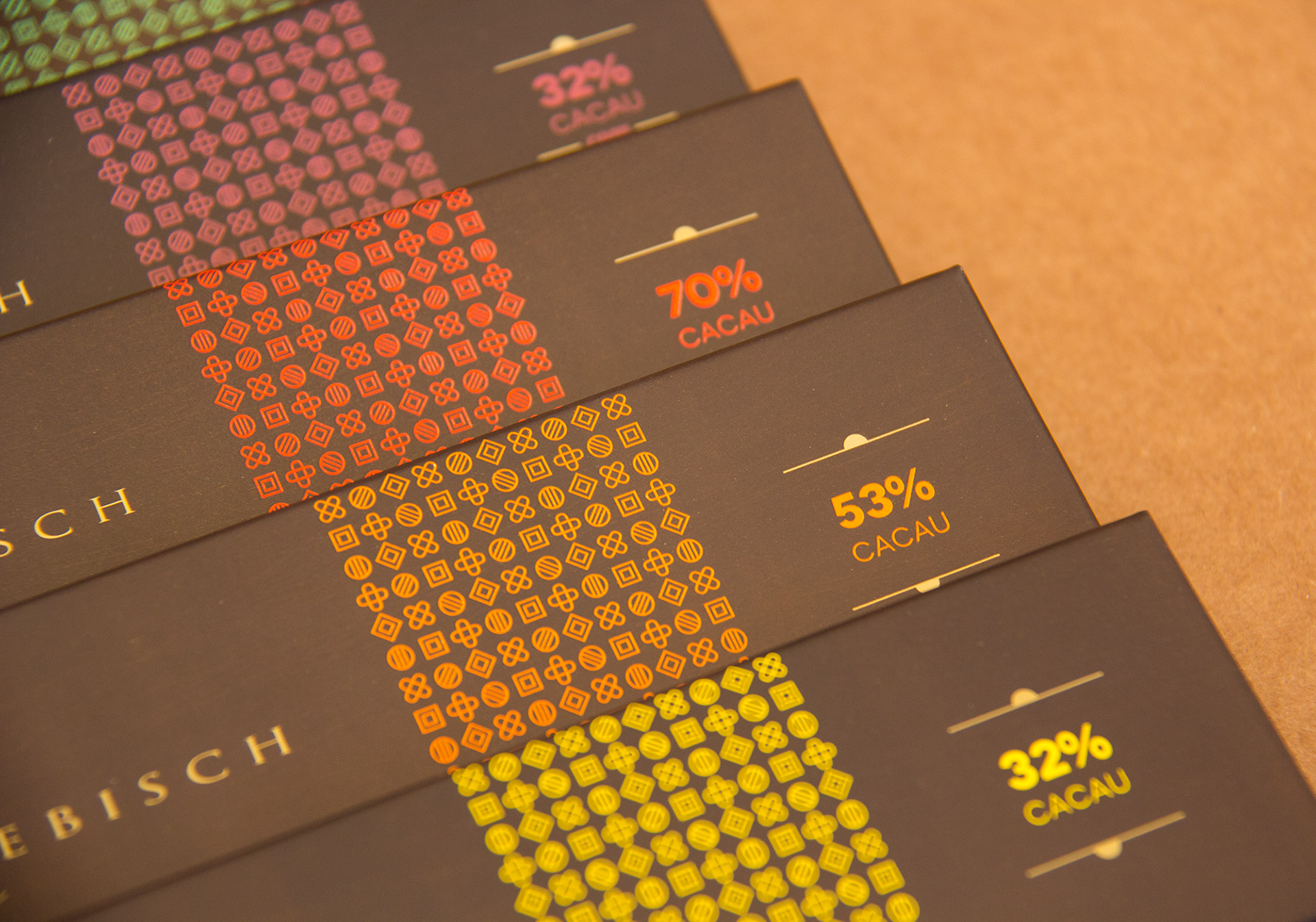
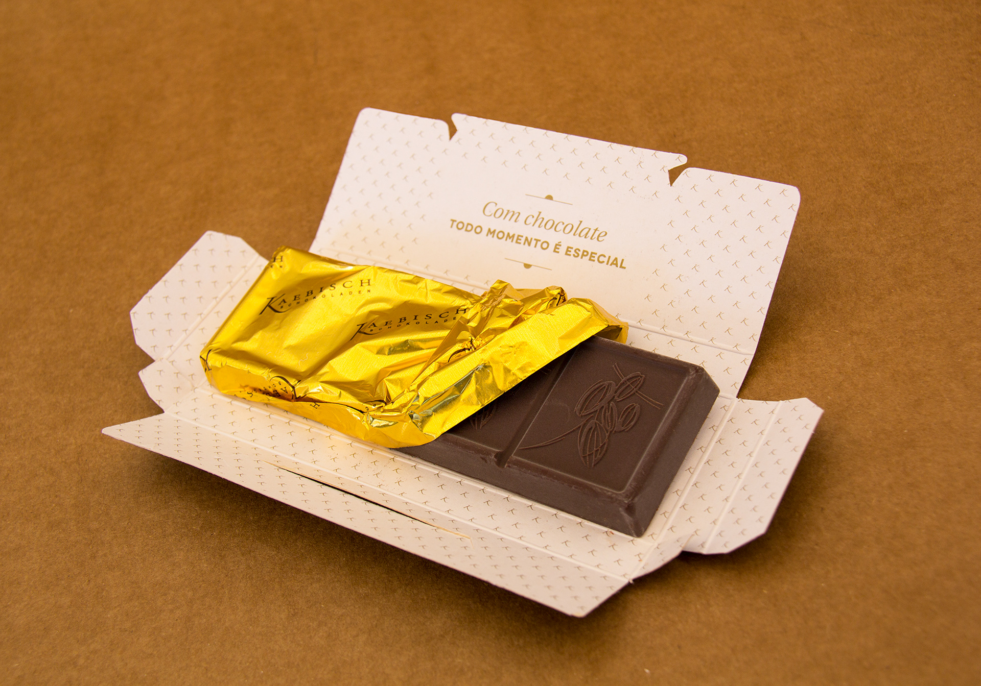
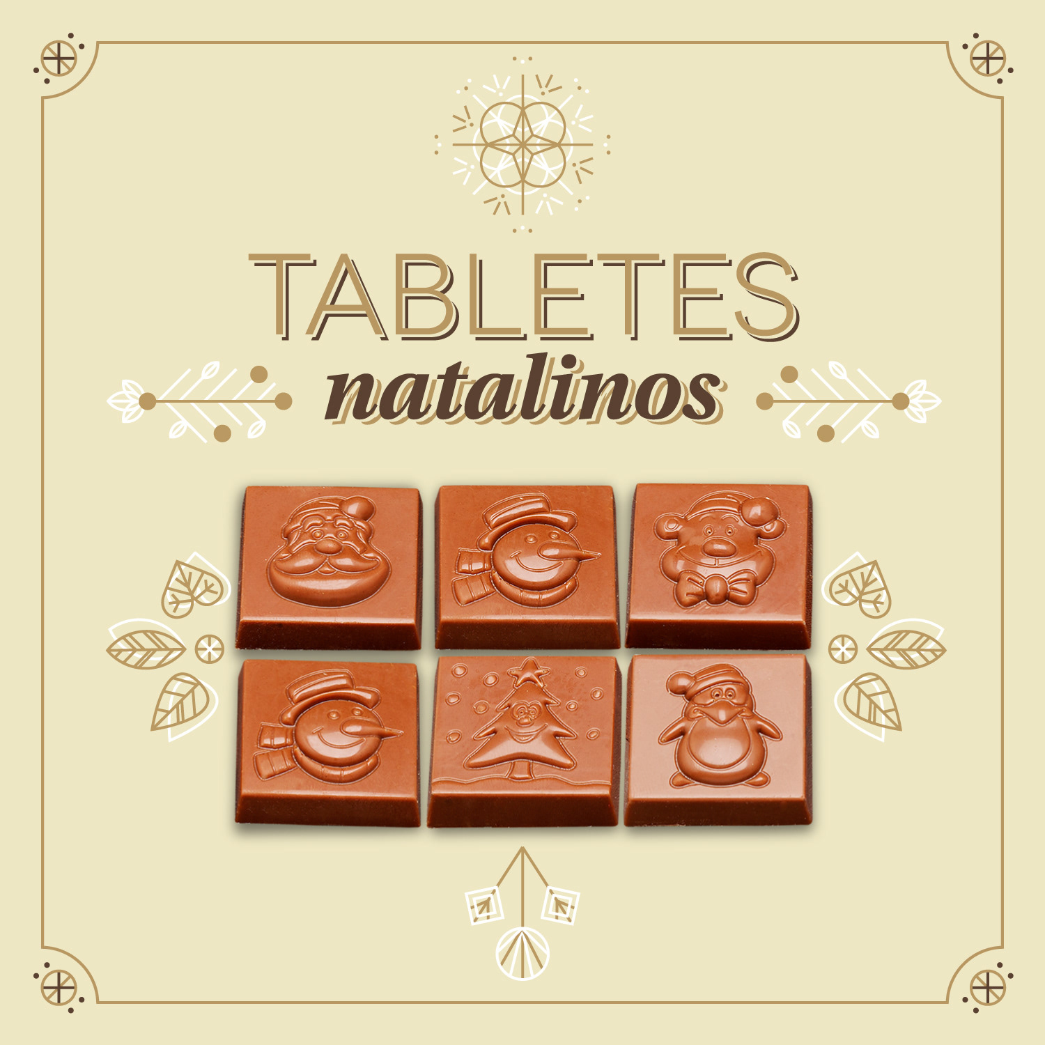
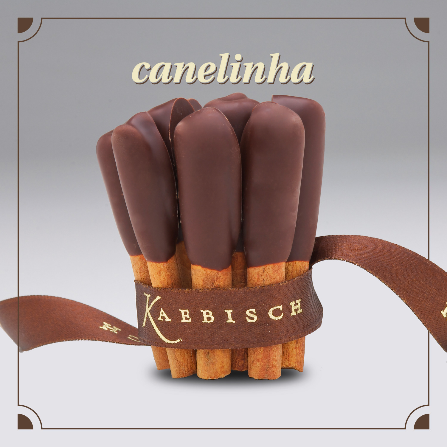
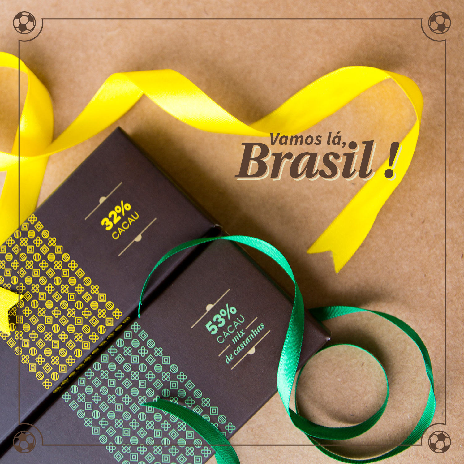
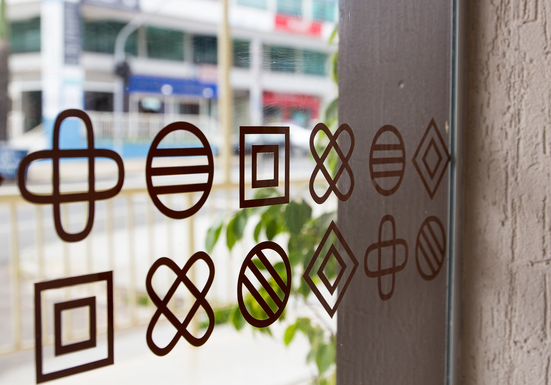
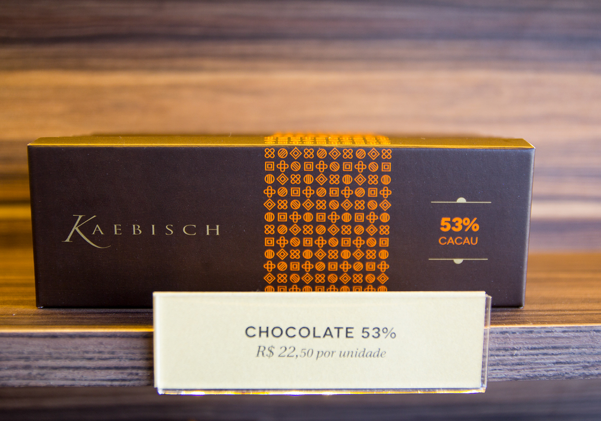
Throughout the project, we redesigned the chocolate bars packaging with a focus on clear and immediate differentiation of flavours based on colours and textures. The patterns are made of modules representing types of chocolate applied in a secondary colour palette based on natural cocoa shades. The new packaging also explores the inside of the boxes conveying messages related to chocolate, with a touch of care and affection to the experience of tasting a real Kaebisch.

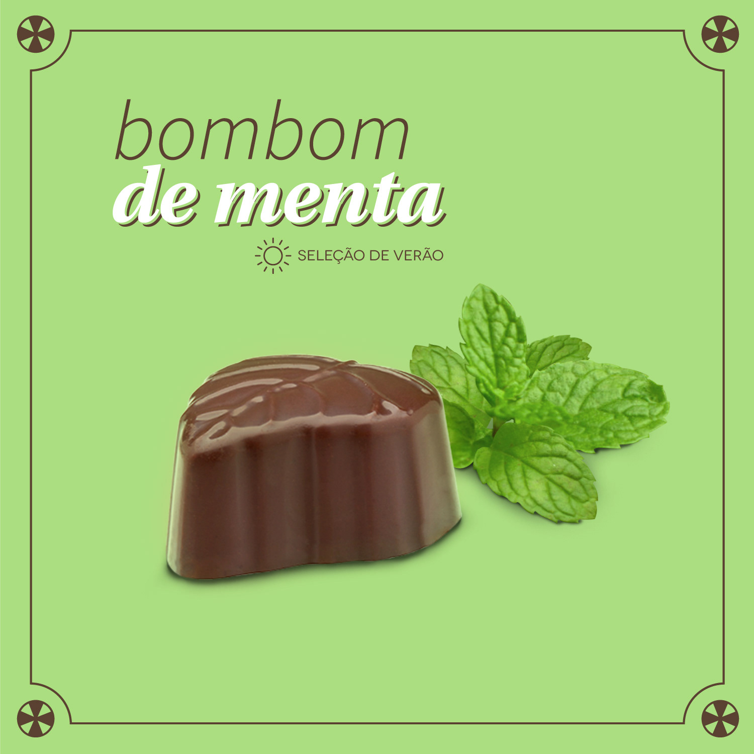
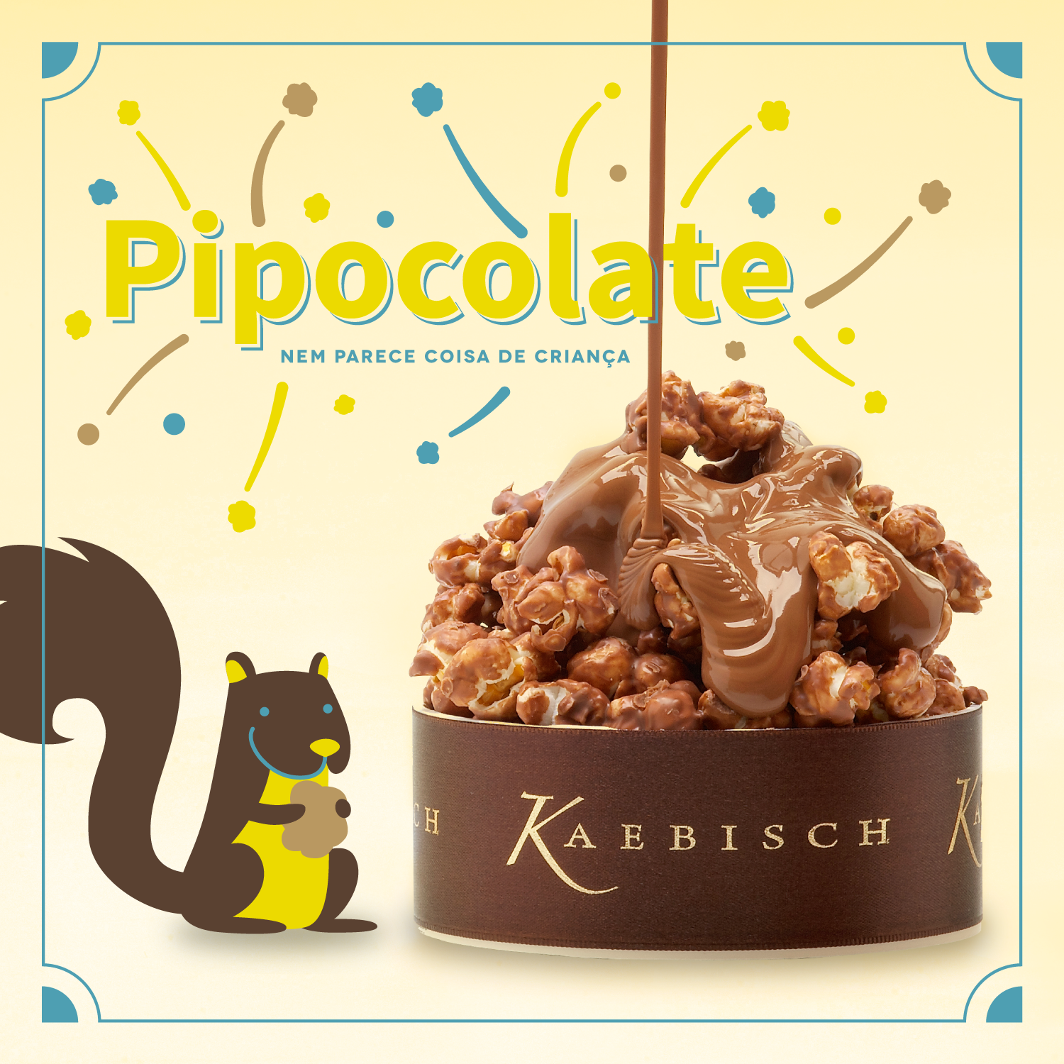
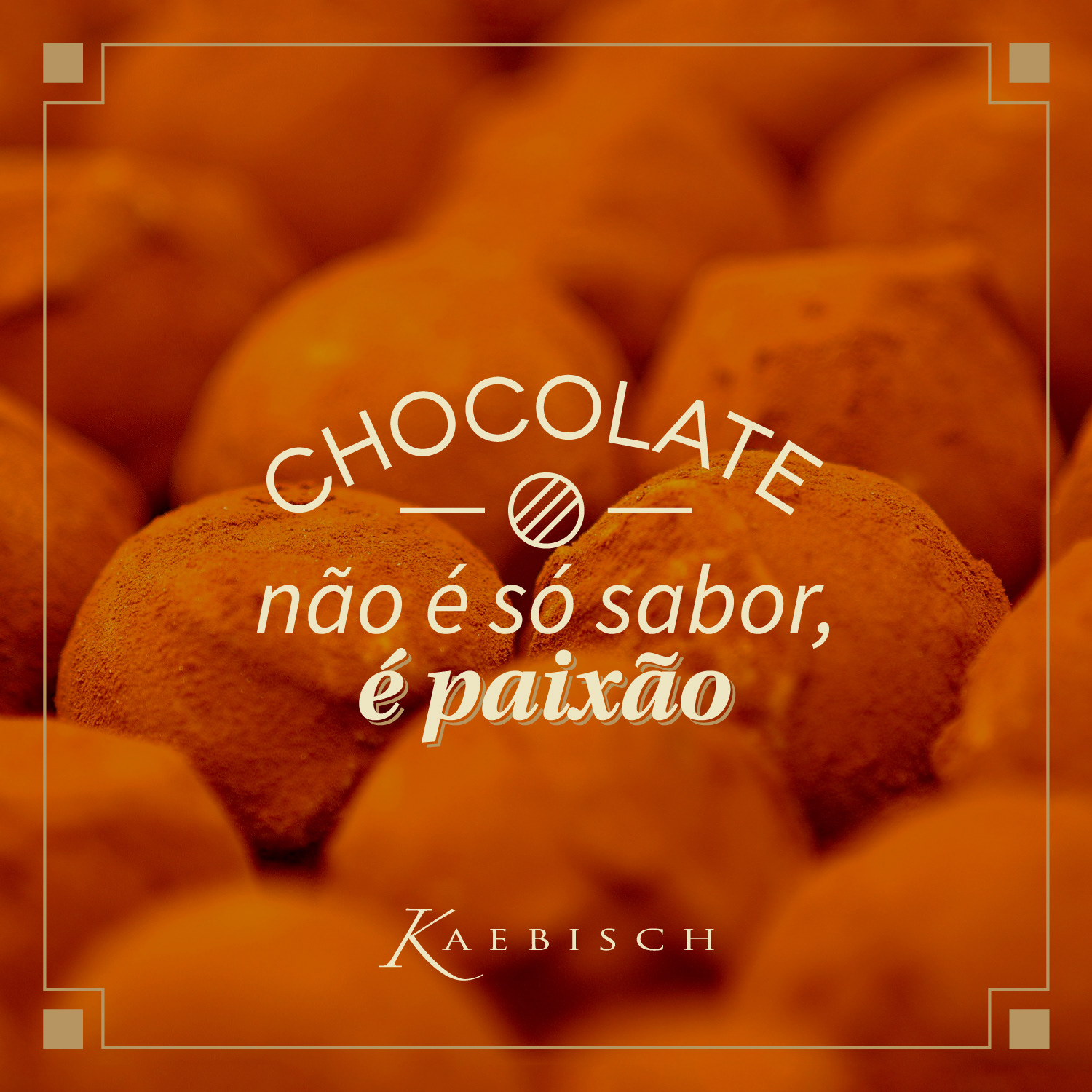
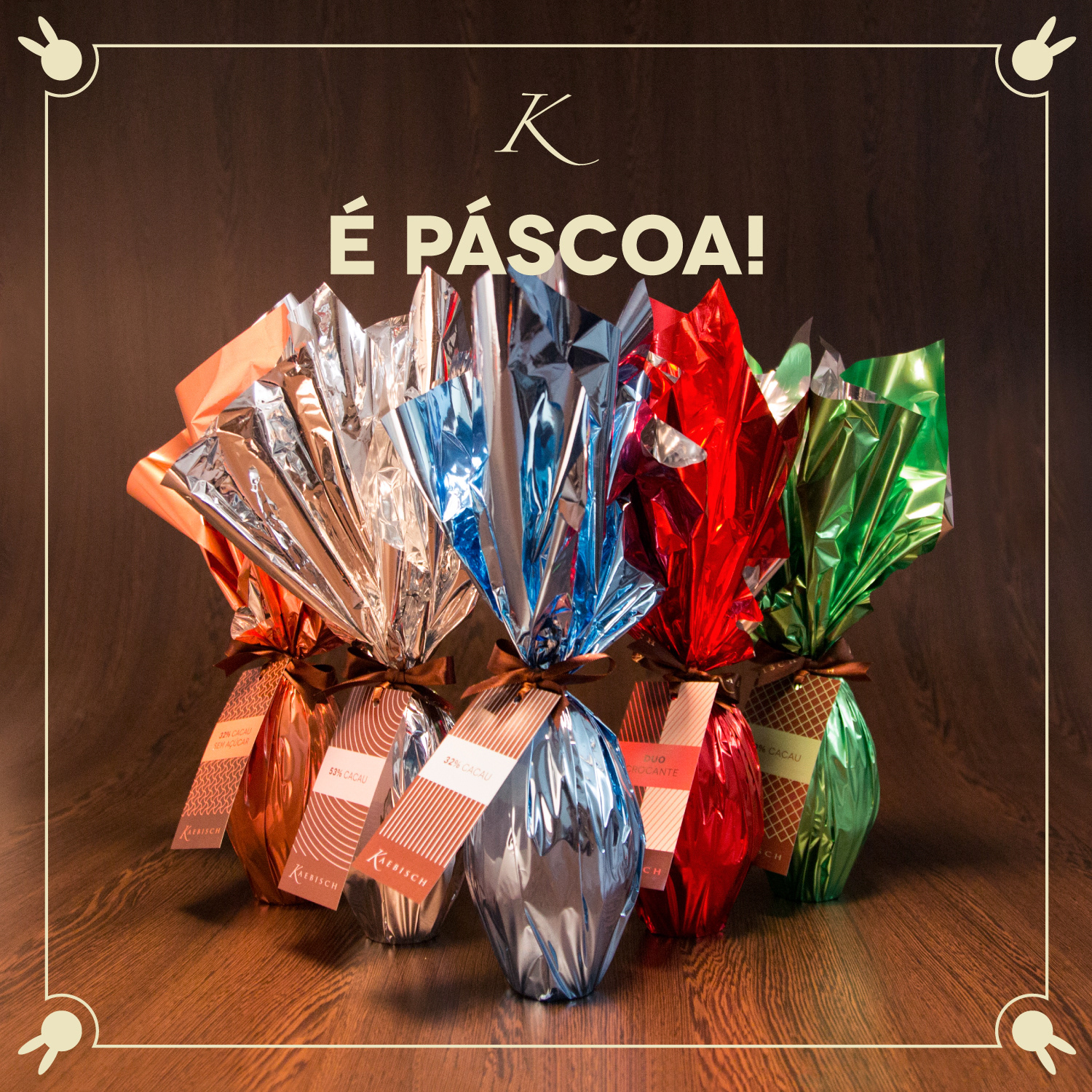
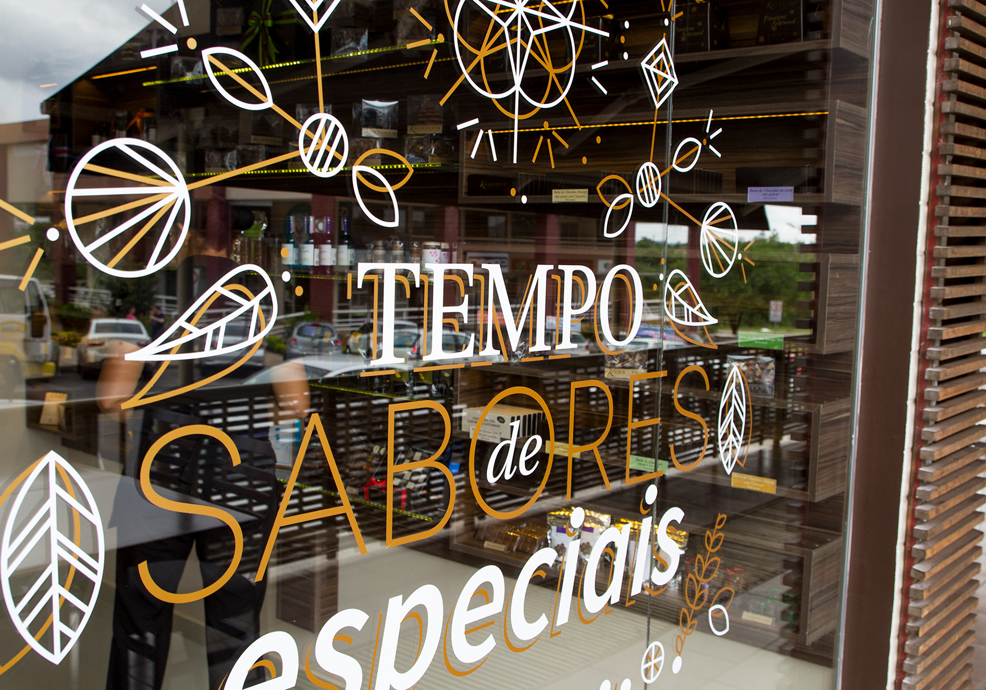
Social media and shops
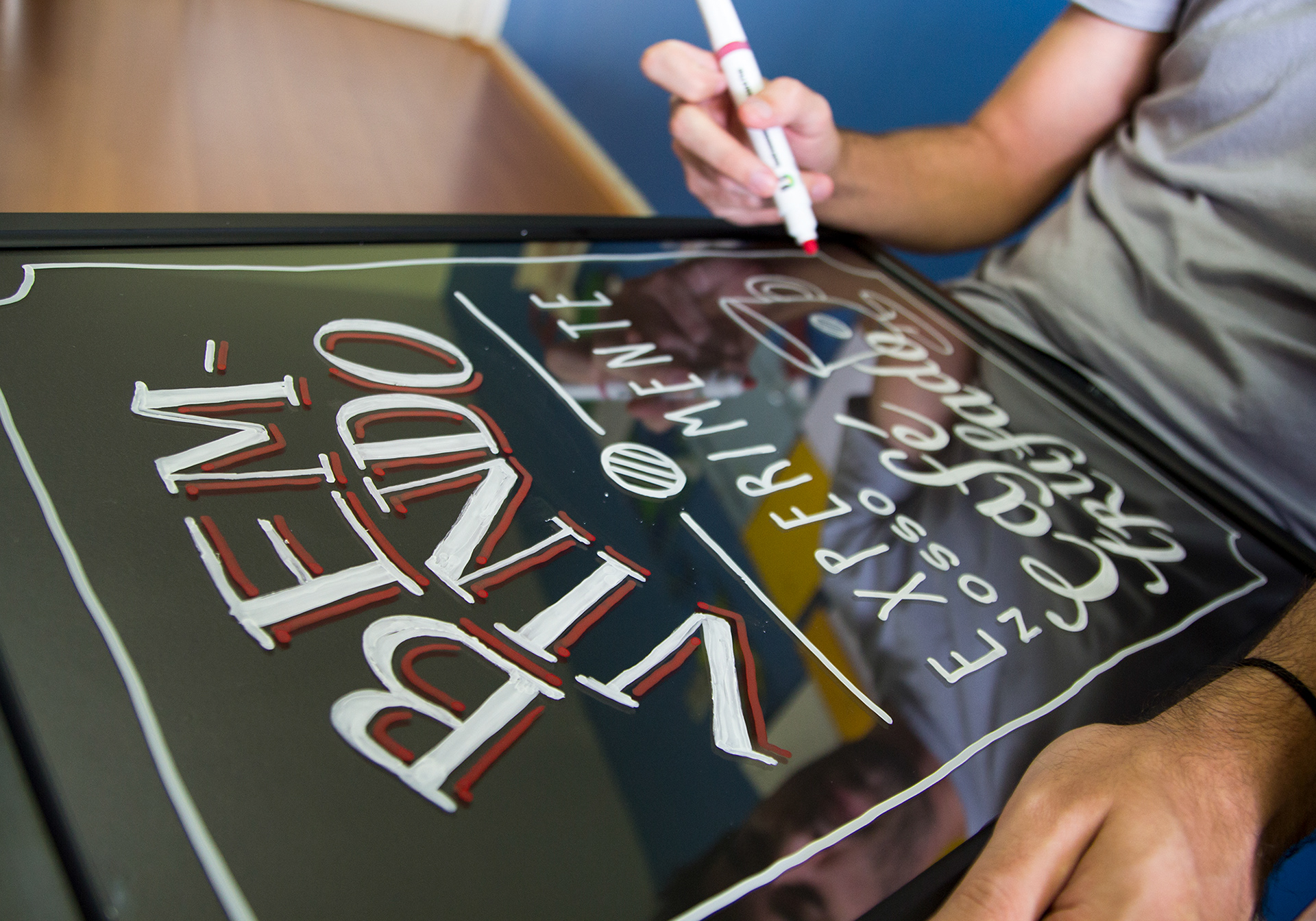
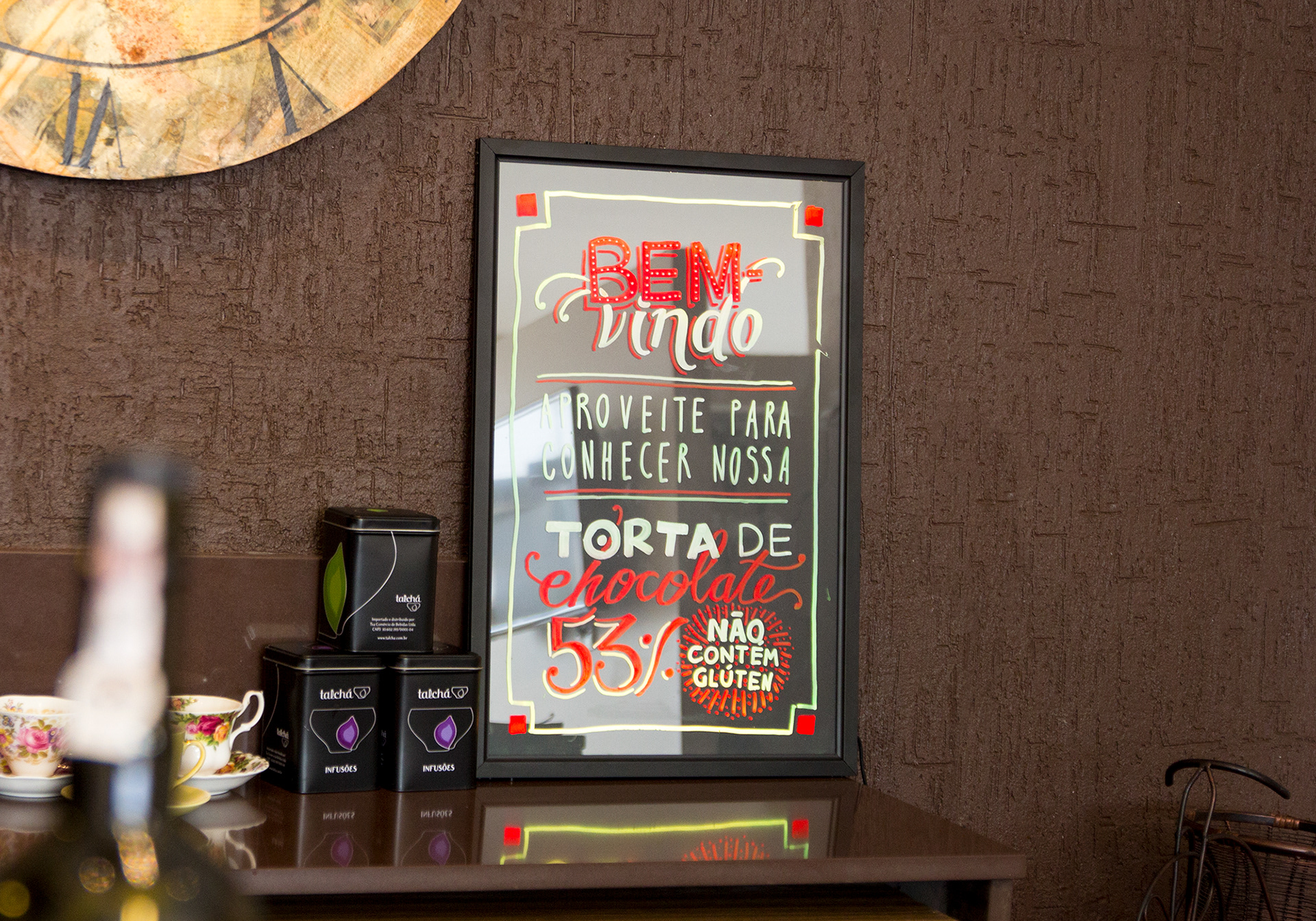
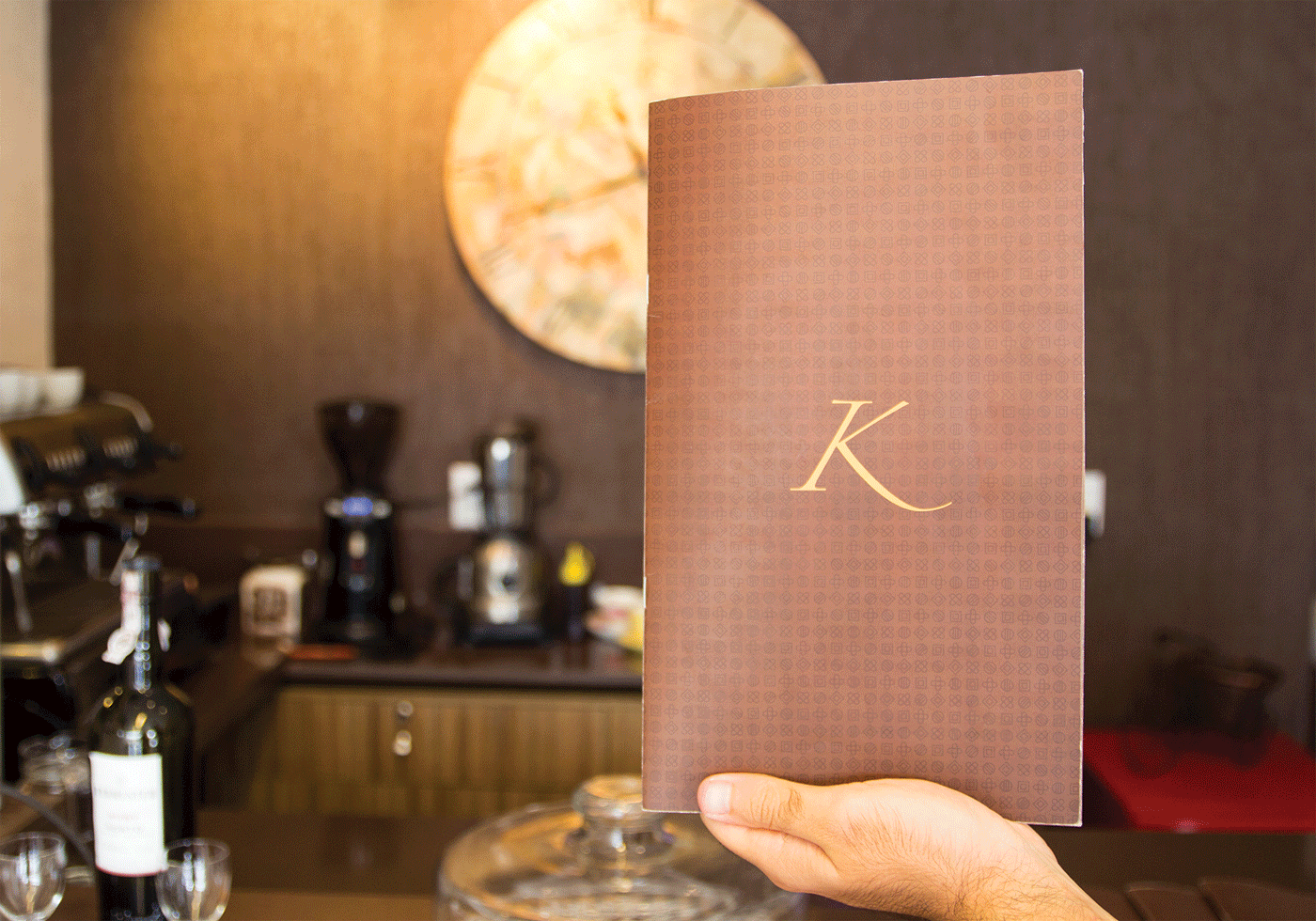
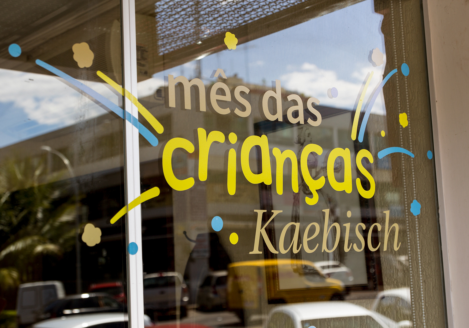
Shop interior and social media presence included design for campaigns, handwritten notice boards, menu design, thematic windows and product tags.


Design team
Teo Horta, Henrique Eira, Henrique Meuren, Ricki Lustoza
Teo Horta, Henrique Eira, Henrique Meuren, Ricki Lustoza
Product pics: Adolfo Burnett